
Mongolian Meat Prices, Seven Years Later
In 2019 I predicted meat prices would drop. They did. Then things got complicated.
Back in May 2019 I wrote about Mongolia’s meat prices, dug into the data on exports, animal losses, and inflation, and even made some forecasts about my predictions on meat prices going forward. At the time beef was 10,904 MNT per kilogram in Ulaanbaatar and mutton was 9,777 MNT. I argued that exports weren’t the main price driver, that animal losses were, and that meat was actually getting more affordable relative to wages.
Seven years is a long time. Since then we’ve had a global pandemic, border closures with China, and the worst dzud since 2010. I wanted to revisit the original analysis with fresh data from the National Statistics Office and see what held up and what didn’t.
The roller coaster didn’t stop

As of February 2026, beef in Ulaanbaatar costs 24,581 MNT per kilogram. Mutton is 19,181 MNT. That’s an increase of 125% for beef and 96% for mutton since May 2019.
But the path there wasn’t a straight line. After I published the original post, prices did come down through the summer of 2019 (my forecast actually got that right). Then COVID hit in early 2020. Mongolia closed its borders, including with China, and exports dropped. Prices stayed relatively flat through 2020 and into 2021.
The real acceleration started in 2022. A combination of post-COVID inflation, rising animal losses, and a weakening tugrik pushed prices up fast. By 2023 both beef and mutton were roughly double their 2019 levels. And then the dzud hit.
Exports: still not the main driver

In the original post I argued that meat exports weren’t the primary driver of prices. The data since 2019 only makes that case stronger.
COVID cratered exports. In 2020 meat exports dropped to 18,769 tons from 33,193 in 2019. In 2021 and 2022 they stayed below 10,000 tons. Yet prices kept climbing.
Then exports bounced back in 2023 to 34,194 tons (nearly matching the 2018 peak of 34,887 tons) and fell again to 24,736 tons in 2024. The correlation between exports and prices remains weak. Prices went up when exports dropped. Prices went up when exports rose. The relationship just isn’t there.
The dzud came back

This is the big story. In 2024, Mongolia lost 9.4 million adult animals. That’s the worst year since 2010’s devastating dzud when 10.3 million died.
But 2024 didn’t come out of nowhere. Animal losses had been creeping up for years: 2.6 million in 2018, 3.0 million in 2021, and then 4.9 million in 2023 before the 9.4 million in 2024. Two consecutive years of heavy losses (14.3 million animals across 2023 and 2024 combined) is something Mongolia hasn’t experienced in recent memory.
The total national herd dropped from about 71 million animals in 2019 to 57.6 million by the end of 2024. That’s a loss of roughly 13 million head in five years, or about 19% of the herd.
Looking back at the original post, I wrote that the 2.6 million animals lost in 2018 was “a very likely explanation for rising prices.” The 2023/24 losses were more than five times that number across two years. The connection between animal losses and prices remains the strongest signal in this data.
Meat prices finally outpaced inflation

This is where things changed from the original analysis.
In 2019 I showed that meat prices had been remarkably stable relative to inflation since 2011. For years, actual prices tracked below what you’d expect if they simply followed CPI. I interpreted this as meat getting cheaper in real terms.
That story flipped around 2022. Both beef and mutton prices broke above the CPI trendline and haven’t come back. Beef at 24,581 MNT is well above the 14,000 or so MNT you’d expect from CPI alone. Mutton tells a similar story.
The combination of back-to-back dzuds, post-COVID inflation (13.8% in 2021, 13.2% in 2022), and a weakening currency appears to have broken the pattern. Meat prices are now outpacing inflation.
Are Mongolians still spending less on meat?

Despite the price increases, the answer is still mostly yes.
I used the same methodology from the original post: a family of three in Ulaanbaatar, each person eating 250 grams of meat per day (roughly in line with average US consumption), earning the average UB salary.
In 2011 that family would have spent about 22.5% of their income on beef (or 19.7% on mutton). By 2019 it was 19.1% for beef and 16.0% for mutton. In 2024: 16.9% for beef and 13.7% for mutton.
The trend held. Wages in Ulaanbaatar have grown faster than meat prices. The average monthly wage went from 470,300 MNT in 2011 to 2,390,700 MNT in 2024, an increase of over 400%. Beef prices increased about 300% over the same period.
There was a noticeable bump in 2022 when wages hadn’t caught up with the post-COVID price spike, but by 2024 the long-term downward trend had reasserted itself. For the average UB household, meat consumes a smaller share of income than it did a decade ago.
The Tsuivan Index, revisited

This was a reader favorite from the original post. I created a price index using December 2010 as the base (100) for several common goods and services tracked by the NSO.
The results are pretty wild. Women’s haircuts have increased 885% since December 2010 (index of 985). Men’s haircuts are up 727% (index of 827). Both have far outpaced beef (505%, index of 605) and mutton (417%, index of 517). Canteen food (the NSO’s current category closest to tsuivan) sits at 494.
In the original post I noted that haircuts were the most surprising price increase. Seven more years of data just made that gap wider. Haircuts continue to outpace everything else in this basket by a large margin. This makes some intuitive sense: haircuts are pure labor, and labor costs in Ulaanbaatar have been growing fast. You can’t import a cheaper haircut from China.
What I got right and what I got wrong
Right: My forecast predicted prices would drop after the spring 2019 peak. They did. Animal losses remain the strongest predictor of price movements. Exports still don’t correlate well with prices. Meat has continued to get more affordable as a share of income.
Wrong (or at least different now): The inflation comparison reversed. In 2019, meat prices tracked below CPI. By 2026 they’re well above it. The 2023/24 dzud was a supply shock large enough to break the pattern that had held for a decade.
The question I raised in the original post about government reserve meat remains as relevant as ever. With 14.3 million animals lost across 2023 and 2024, the pressure on herders and on consumer prices is real. Whether the government’s reserve meat program can meaningfully buffer against shocks of this scale is still not clear from the available data.
All data in this post comes from Mongolia’s National Statistics Office (1212.mn).
Are Mongolian Courts Biased? 75,000 Criminal Cases Say Mostly No
But your employment status still matters more than it should.
International criminology research has consistently found that demographics influence criminal sentencing. In the United States, Sonja Starr’s 2012 study found that men receive 63% longer federal sentences than women, even after controlling for the offense. Studies from Russia, Poland, and elsewhere have documented similar patterns with gender, education, and socioeconomic status. The general finding across countries: who you are affects how you’re sentenced, even when it shouldn’t.
Mongolia publishes all of its court decisions online at shuukh.mn, a public database maintained by the judiciary. Every criminal case, with the full text of the decision, is there for anyone to read. I’ve lived in Mongolia since 2012 and have spent a lot of time digging into Mongolian data for this blog. So I wanted to test a simple question: does the same pattern of demographic bias show up in Mongolian criminal courts?
I collected and analyzed 75,323 decisions from Mongolia’s Criminal Court of First Instance, covering 2020 to early 2026. Let’s take a look at what the data says.
What’s in the data
Each case on shuukh.mn is a full court decision written in Mongolian. Here’s an example: a 41-year-old male herder from Tuv Province, primary education, family of 5, no prior record. He stole 700,000 MNT (about $200 USD) from an acquaintance, pled guilty, paid restitution, and was fined 500,000 MNT.
That single decision contains most of the variables I extracted: demographics (gender, age, education, employment status), the crime (Criminal Code article, category), and the outcome (sentence type, amount, aggravating and mitigating factors). Not every decision has every field. Age, for example, is missing from 42.7% of cases. But across 75,323 decisions, the coverage is good enough to work with.
Here are a few more cases to give you a sense of the range:
- Case 84144: A 39-year-old employed woman in Nalaikh (Ulaanbaatar), secondary education, convicted of seriously injuring her spouse with a knife while intoxicated. 3 aggravating factors, 5 mitigating factors. Sentenced to 41 months imprisonment.
- Case 44606: A 24-year-old self-employed man in Khan-Uul district, secondary education, convicted of a traffic offense that caused serious injury. No aggravating factors, 4 mitigating. Given a 12-month suspended sentence.
The defendants are overwhelmingly male (86%), with a median age of 34. Most have a secondary education.
What Mongolian criminal justice looks like
The picture is pretty different from what you’d see in the U.S. or Europe.

Fines are the dominant outcome. Out of 75,323 cases, 42,517 (56%) resulted in a fine. Imprisonment is a distant second at 11,859 cases (16%), followed by community service, suspended sentences, and probation. Mongolian courts are not sending most convicted defendants to prison.

Over half of all cases (53%) involve violent crime, which under Mongolia’s Criminal Code covers chapters 10 through 13 (assault, domestic violence, robbery, etc.). Property crime is the next largest category at 25%, followed by traffic offenses at 13%. Drug cases are relatively rare at just 2% of the total.
I converted all sentence types to a common scale of “month-equivalents” so I could compare across fines, imprisonment, and other sentence types. Fines were converted using the Criminal Code’s own formula (15,000 MNT per day, or about 450,000 MNT per month). This gives us a single severity measure that works across the full range of outcomes.
The employment surprise
In the international literature, gender and race are the usual suspects for sentencing bias. Mongolia doesn’t have the racial diversity that drives disparities in places like the U.S., so the question here is about gender, education, age, and employment.
Employment status turned out to be the standout finding. It’s the only demographic variable that survives rigorous statistical correction across all model specifications.

Unemployed defendants receive an average of 13.9 month-equivalents in sentence severity, compared to 6.8 for employed defendants. That gap of about 7 months in the raw data shrinks to 3.7 months after controlling for crime type, criminal history, and aggravating and mitigating factors, but it remains highly significant (p < 0.001). It’s consistent across every model I ran: OLS, multilevel, log-transformed, different sample definitions. Employment status is the one demographic variable that keeps showing up.
To put that 3.7-month effect in perspective: the average fine in the dataset is about 1.3 month-equivalents. So the employment penalty is roughly equivalent to moving from a typical fine to a sentence that’s nearly three times as severe. Employment status is not a legally prescribed sentencing factor in Mongolia’s Criminal Code. It shouldn’t matter. But it does.
Gender: more complicated than it looks
Gender is where a simple analysis would give you the wrong answer.
If you run a straightforward regression with all 29,847 complete cases, the gender coefficient is small and doesn’t reach statistical significance (p = 0.074). You might conclude that Mongolian courts treat men and women roughly the same. That would be partially right and partially wrong.

A two-stage model tells a different story. In stage one, looking at whether a defendant is imprisoned at all (N = 40,626), women are 41% less likely to be imprisoned than men with similar cases (odds ratio = 0.59). That’s a large effect. But in stage two, looking only at defendants who were actually imprisoned (N = 5,578), women receive sentences about 4 months longer than comparable men (p = 0.003).
This is a classic Simpson’s paradox. The overall average hides two opposite effects that cancel each other out. Women get lighter treatment at the imprisonment decision stage, but the women who do end up in prison tend to have committed more serious offenses (they had to clear a higher bar to get there), and they receive correspondingly longer sentences.
So gender does matter in Mongolian sentencing, but it operates through the imprisonment decision, not through sentence length.
What actually drives sentencing
The most reassuring finding from this analysis is about what happens when you decompose what’s actually driving sentencing variation. I ran a sequential regression, adding blocks of variables one at a time to see how much each group contributes.

Aggravating and mitigating circumstances (things like whether the defendant confessed, compensated the victim, or committed the crime while on probation) explain 16.2% of sentencing variance. Demographics explain 3.7%. Crime type adds 3.1%. Court effects and year effects are basically noise at 0.5% and 0.2%.
In other words, the legally prescribed sentencing factors explain more than four times as much variance as all demographic variables combined. Mongolian judges are, for the most part, following the law. The system isn’t perfect (that employment gap is real), but it’s not driven by demographics in the way that research from other countries might lead you to expect.
What the data doesn’t tell us
I should be upfront about the limitations. Age data is missing for 42.7% of cases, and that rate is getting worse over time (32.5% missing in 2020, 61.5% by 2025). More recent court decisions appear to have shorter biographical sections. The primary analysis uses complete cases only (29,847 of the 75,323 total), though the results hold up when I relax the age requirement and use a larger sample of 36,829.
The severity measure for non-imprisonment sentences (community service, suspended sentences, probation) is approximate. I used the fine-to-months conversion from the Criminal Code, but reasonable people could argue for different conversion rates. I ran sensitivity checks with both conservative and liberal conversion rates, and the key findings hold.
And of course, there are things the data simply can’t capture: quality of legal representation, the specifics of each case beyond what’s coded, and whether plea bargaining plays a role that isn’t visible in the final decision text.
What this tells us
Mongolia’s criminal courts are not primarily driven by demographic bias. Legal factors dominate sentencing, and court-to-court variation is minimal (courts explain less than 1% of variance after case-level controls). That’s genuinely good news, and it’s worth saying clearly.
But the employment gap is a real problem. A 3.7-month penalty for being unemployed, after controlling for everything else, means that economic status is influencing outcomes in ways the law doesn’t intend. Whether this reflects conscious bias, unconscious assumptions about defendants' “stability” or risk of reoffending, or some unmeasured confound, the data can’t say. But the pattern is consistent and substantial.
The fact that we can even have this conversation is thanks to shuukh.mn publishing every court decision. That level of judicial transparency is more than most countries offer. Mongolia doesn’t always get credit for the things it does well in governance, but open court records is one of them.
If you’re interested in the details, the full analysis code and notebooks are available on GitHub.
Do families with more children make less money?

Any parent will tell you that having children is expensive. Raising children takes large quantities of clothes, food, education, toys, and the most costly thing of all, time.
Those same parents will also probably tell you their children are the best things they have made in their lives. As my wife has started saying, once you have children, you make every decision in your life with them in mind.
Women in Mongolia tend to have more children than in Western countries. In 2019 there were 2.8 children born per woman in Mongolia, significantly lower than the peak in 1965 of 7.5 children born per woman.
Let’s put this trend in perspective and compare Mongolia’s fertility rate with other countries.

We can see that it is a widespread trend for birth rates to have gone down over time since 1960. Yet around 2005, the trend in Mongolia started going up again. Mongolia today has a similar birth rate to China’s in 1979.
Other former communist countries show a similar trend. According to World Bank data, Kazakhstan, Russia, and Kyrgyzstan showed a decreasing birth rate that hit the lowest point around 2000. Since then, the birth rate in these countries has gone up.
I’m not sure what caused this “baby bump,” but it is certainly notable. I’ve been told by many Mongolians that increasing the country’s population is a matter of national security and that a high birth rate is a good thing.
When I asked why I was nearly always told the same reason. Since powerful, high population countries surround Mongolia, the country needs more people. This reason sounds quite lovely and patriotic. Unfortunately, at current birth rates, it would take hundreds of years to match even Russia’s population of 144 million, not to mention China’s 1.4 billion people.
So perhaps Mongolians have more children because of a sense of national pride or because they are freer than in the communist past. Perhaps what motivates some women is the “honored mother” medal to mothers with four or more children.
All of this got me thinking about the economics of having more or fewer children. It seems clear that families with more children probably spend less money per child or buy less expensive products than a family with fewer children.
But what about income? Do families with more children make less money? I dug into the 2019 Household Socioeconomic Survey run by the National Statistics Office to answer this. I calculated the average annual household income by the number of children. Let’s take a look.

Households with two children earn the most money on average. Households with five children earn roughly 40% less than households with two children.
Households with 0 children make the least. This is perhaps because these households are either relatively young or old enough not to have children in the house.
While this is a very clear picture, the cause isn’t clear. Do couples choose to have fewer children so both mother and father can work? On the opposite end, are mothers (or fathers) choosing the stay home to care for the children, resulting in a lower household income?
In 2020 Mongolia increased the child allowance to 100,000MNT per child under 18. It would put an average household with five children at nearly the same income as two children. The Mongolian government either wants to encourage people to have more children or support those families that choose to.
You probably have a pretty strong opinion of how many children are “right” for your family. Family planning is a very personal decision. The data reflects averages about the population and isn’t destiny for any particular family.
Mongolia’s current baby bump seems like it might deflate in the coming years. What remains is a very high percentage of young people. 31% of Mongolians were under the age of 14 in 2020. Overcrowded schools and traffic seem to be the result. We don’t know yet whether those born in the baby bump (after 2003 or so, mainly Gen Z) will end up better off than their millennial parents.
2021 Wrap-Up: Are Mongolians richer today than in 2011?

As 2021 ends, I’m reflecting on all the changes I’ve seen since I moved to Mongolia in 2012. As I’ve thought beyond the KFC’s, the CU’s, the new malls, and other surface level “developments”, I’ve been thinking of larger questions. One of the bigger of these large questions is a simple one, are Mongolians making more money than they used to?
It seems that every time you see statistics about average salaries in Mongolia, it seems to always be increasing. This was reinforced recently when the Lemon Press newsletter (link in Mongolian) noted that 6% of Mongolian make more than 3 million Tugriks per month (about $1,050 USD at the current exchange rate).
Their data, sourced from the National Statistics Office (of course where else?), also showed that nearly 25% of Mongolians make more than 1.5 million Tugriks per month. Lemon Press only looked at 2020 to 2021, and given my contemplative mood I wanted to compare a larger date range.
So, let’s do just that.
Do nearly 10 years make a big difference?
Before you see the chart, think back on your own life in the past 10 years. Ask yourself, have things gotten better or worse economically for you and your family over this time? I’m hoping the answer is better, and probably for most of you, it is.
One way to see how things have changed is to group households by an income bracket, 300,000-600,000 MNT per month for example. We can compare the number of households in each of these brackets over time to see if households are making more money than they used to.
The latest data available is from 2020 and goes back to 2011. Let’s see how Mongolian households have changed their income over these 9 years.

Wow, what a difference 9 years makes. My first reaction when seeing this chart was a good kind of shock. I was impressed by how this income distribution has moved up so much. Rather than a downward sloping graph where most households are in the lower bracket, more than half of households now make more than 900,000 MNT per month.
This is notable progress and it shows that Mongolia’s economy is rewarding those with marketable skills and entrepreneurial ability. There is always a good amount of criticism towards petty capitalism or corrupt officials, but I continue to see healthy businesses providing valuable services to Mongolians.
With that good news given, I want to bring up a point of concern with this data.
What about inflation?
Ah yes, inflation. That ever-present beast that gnaws away at your hard-earned savings. Inflation is often discussed in Mongolia, but often in terms of consumer prices or savings rates. Yet my point of concern is connected to spending power.
Inflation causes prices to rise, which is of course not good if your income is stagnant. If your income is going up, then you are racing inflation to improve your living conditions. Which will rise faster, your salary or the prices in the stores and the price of apartments?
In 9 years, from 2011 to 2020, the average monthly wage in Mongolia tripled. This is an impressive statistic, but what about inflation?
Let’s see how average monthly wages fared when adjusted for inflation.

To make the chart above I took the consumer price index (CPI) inflation measure for each year and adjusted the average monthly wage for that year. The results are less impressive than the income bracket chart above.
Instead of seeing wages triple over 9 years, we see a 59% increase. Put another way, if you made 1.2 million MNT a month in 2020, that is equivalent to about 670,000 MNT per month in 2011.
This is still very positive, and there have been many positive economic signals in these years. A major signal of this was in 2015 when Mongolia changed classifications from a lower middle-income country to an upper-middle-income country.
There are still areas of concern. What’s missing from the above data are those that choose not to disclose their income. This could be a large group of people on the lower end who don’t have consistent work. It could also be those at the very high end, whose income will come from investments in areas that are not a traditional job.
These blind spots in the data will be the areas average people get the most upset about.
So with 2021 wrapped up let’s look forward to the next several years.
What’s ahead for 2022 and beyond?
I won’t be making predictions, because that is a fool’s game. But I would like to make some observations about areas I’ll be looking at in 2022 and beyond.
Mining continues to grow and contribute significantly to Mongolia’s economy. The negotiations over Oyu Tolgoi are almost guaranteed to end up favorably for Mongolia, and Rio Tinto will be happy to have the dispute over with so the real business of money making can continue with the underground expansion.
The past few years have shown a big increase in the Mongolian Stock Exchange with both valuation and volume. Yet recent IPO’s have been underwhelming. The recent CU IPO is one example. It seems clear this IPO was designed to inject money into the business so the original investor(s) could have a nice exit and recoup their initial investment. Never mind a lack of profitability and a sliding stock price.
If 2022 brings more IPO’s of this type then the Mongolian Stock Exchange will lose whatever attention it started to receive from international investors.
I’m desperately hoping that Mongolia’s economy will diversify. Venture capital has proven to be the key ingredient in the United States' success in innovation and tech. Yet the venture capital field in Mongolia is almost non-existent. Investors want high short-term gains. 9 out of 10 venture bets fail in the US, a statistic almost guaranteed to make a Mongolian investor stay away.
Even so, I’ve been impressed with the nascent display of startups, both tech and non-tech. This shows that young people especially are hungry to see the economy improve, even if the older generation isn’t always willing to help invest.
My wish for 2022 is for companies to realize that starting in Mongolia then expanding internationally is a difficult and perhaps losing formula. The Mongolian market and international market have few similarities, and the average European consumer wants very different things from the average Mongolian consumer. I would love to see companies start with the sole intention of selling their products or services internationally.
This would allow higher salaries that can compete with the mining industry and perhaps attract highly skilled workers who would otherwise leave the country to work abroad.
Welcome to 2022
I hope you’ve enjoyed the articles on Mongolian Data Stories over the past few months. I believe strongly that these explorations in Mongolian data can improve our understanding of the country we live in. After all, with the proper understanding, we can take effective action to improve our lives.
I wish you all a happy and prosperous 2022! Thank you for reading!
Which grocery store in Ulaanbaatar is cheapest?

Since moving to Ulaanbaatar in 2013, I’ve been to nearly every market in the city. I was struck by the opposite worlds of the zakh and the supermarket. One feels bustling but is arguably less convenient (no carts, very little parking). The other is more structured and has more packaged products but is often lacking in the selection of fresh foods. In some ways it’s indicative of the dichotomy that exists in Ulaanbaatar in general between the new and the old, the urban and periurban.
Zakh (зах) translates to market and is segmented in different areas such as vegetables and fruit, meat, and dry goods. In each area, vendors rent or own stalls where they sell their products. The products in each section are generally the same from stall to stall, with little variation. Cash used to be the only way to make a purchase, but more recently, card machines have become quite common (even preferred!).
A supermarket in Ulaanbaatar is pretty comparable to western supermarkets. Aisles of products with often many choices for each product. The main exception is the meat section. I’ve noticed that most supermarkets in Ulaanbaatar don’t stock much fresh meat, and if they do the selection is quite small (except Emart, which has a quite large meat section).
Even casual observers will note that prices in a zakh are lower than in supermarkets. Most of us only have a limited sample to work with, which means our observations are limited. Fortunately, the National Statistics Office of Mongolia tracks weekly prices for several products at all major supermarkets and zakhs in Ulaanbaatar. The products tracked are staple food products (meat, flour, bread, butter, eggs, etc.) that are most common in households. My understanding is this data feeds into consumer price index (CPI) inflation calculations based on the basket of goods identified by the government.
Don’t know what a “basket of goods” is? Imagine a shopping cart for the whole country. What set of products would nearly every family choose to purchase for their home? Probably basics like flour, eggs, milk, bread, meat, potatoes, carrots, and a few others. This set of products is then tracked to understand both CPI and can also be used to assess things like the poverty line, cost of living, and others.
You probably aren’t aware of this data source, as it is available only on the Mongolian 1212.mn page and also under a menu that might not grab your attention. If you are interested, check it out here.
I identified three questions I wanted to answer while looking at the data.
- Which markets are most/least expensive over time?
- Did COVID-19 have a noticeable impact on prices?
- Do markets use psychological pricing? For example, carrots for 1,899 instead of 1,900 tugriks.
So, let’s get to it!
What markets and products do the data cover?
Here is a heatmap showing which products are available at each market around the city. Market names and product names were translated into English.

As you can see, not all products are always available at every zakh or supermarket. Goat meat and reserve meat are two notable items here. Goat meat isn’t always in demand in Mongolia, and reserve meat is only seasonably available depending on the Ministry of Agricultures program to provide low-cost meat.
I merged Mercury and Ikh Nayad as most of the shop keepers from the old Mercury market moved to Ikh Nayad. Also, Max Supermarket changed its name to M Mart, so I’ve reflected that in the chart as well. Saruul is a newer zakh, so there weren’t as many records for it.
From all the products in the chart above, I decided to select the eight common products (in my mind) to make the further analysis simpler and a bit easier to digest. They are:
- Suu Brand Milk, 1L
- Egg, Russian
- Potato, Mongolian
- Carrot, Mongolian
- White Rice
- Atar Brand Bread
- Beef w/Bones
- Mutton w/Bones
There will always be “one more thing” people may want to see in the analysis, but I hopefully covered the most common products. From here, let’s move on to looking at price differences between markets.
Which markets are most/least expensive?
If you live in Ulaanbaatar, I’m sure you already have an opinion about this. Something like,
“The meat is good at Bayanzurkh, but it’s cheaper at Bars.”
Or perhaps something more specific and even devious.
“Emart sells their vegetables for cheaper, but their meat is always the most expensive. But it’s great quality (Because obviously if it’s more expensive, it’s better quality!).”
I’ve never been to a country where people didn’t complain about prices in the store. It’s practically part of the human condition. Personal observations are always made with a limited sample, so let’s step back and see what the data says.
It was tough to figure out how to present this data. I generally prefer to show a time series to give the complete picture and let people decide. Even with only eight products, the time series graphs were confusing, and there wasn’t much of a clear point. I wanted to take a different approach.
A dumbbell chart allows you to see the difference in two times of several things all in one chart. You lose everything between those two times, but it gives a simplified picture that is much easier to digest than a line plot.
I created one chart for each of the eight products I selected. Each chart shows the difference in price from November 2019 to November 2021 for each market. This allows you to see how prices have changed and which markets are cheaper or more expensive between these two times.
Let’s take of look to see how eggs have changed in price over the past two years.

You can see that the price of eggs has increased. Supermarkets are also clearly more expensive per egg. The most expensive supermarket is 25% more expensive than several of the zakh’s.
I built a dumbbell chart for each of the eight products. Here is a gallery showing each of the charts.


After looking at these, you can come to some pretty easy conclusions. For most products, supermarkets are more expensive than at the zakh. Also, pretty much everything has gotten more expensive in the past two years. The exception is potatoes, specifically at Emart. For some reason, those got cheaper. Insert sinister conspiracy theory here.
I also think it’s worth it to look at the supermarket you usually shop at and ask yourself why you shop there? Are you sensitive to small changes in price, or do you choose your store because of convenience? If you are very price-sensitive, you now have some better information to make your decision. If not, well, then you at least know what the price picture is in other places.
One thing that surprised me is that Emart is not always the most expensive supermarket. It was my observation going into this article, and it didn’t seem to be true. Just keep in mind that our sample of products is limited to a few everyday staple products. Emart may keep prices low for these products to drive customers to the store and then charge higher prices for prepared or packaged food.
Let’s move on to the next question.
Has COVID-19 impacted prices?
There isn’t much to do here besides plot a time series of prices and take a look. Here it is. I’ve excluded meat prices as they are significantly higher than the other prices. The prices in the chart below are the average weekly prices of all markets in the dataset.

Considering that COVID-19 started in 2020 and the first serious lockdown happened in late 2020 in Mongolia, we don’t see much change in prices during that time. What we do see is a pretty significant increase in the past few months. In July 2021, carrots went above their maximum price from the previous two years. For the other products in the list, we see a clear upward trend since around September 2021.
There are many moving pieces to get products from the field to the market, so it isn’t easy to know what is causing the recent spikes. You would expect that you would see the market respond by adjusting prices after an increase in fuel prices or a market shock like a lockdown. This didn’t happen until very recently. I found this very odd.
AI-92 prices increased by 300 MNT per liter in July 2021, so there could have been a delayed impact. Combined with the Chinese border closure, these events could put more pressure on supply by increasing costs and restricting imports. Economists with more knowledge than me of Mongolia’s market dynamic could probably explain this better than me.
Lastly, I wanted to look at how markets price their products and perhaps see whether they use psychological pricing or not.
Do markets use psychological pricing?
Psychological pricing is when a business uses pricing strategies to either make the customer feel better about the product or make the customer believe it’s cheaper. For example, a product could be priced for 1,999 tugriks instead of 2,000 tugriks.
There are several psychological pricing strategies, and honestly, I didn’t want to test all of them for every product. One simple test is to count the frequency of prices that end in a certain number of zeros. For example, a price ending in three zeros would be 1,000, 4,000, etc. This tells us the price is an even thousand. We can repeat this test for one zero (‘0), two zeros (‘00), and three zeros (‘000).
Here are the results for three zeros (‘000).

From the chart above, zakhs tend to have prices in the thousands and supermarkets don’t. This intuitively makes a lot of sense, as markets may commonly accept cash, and items are purchased at individual stalls. At supermarkets, items are put into a cart and added up. So the price for an individual product is less noticed at a supermarket than a zakh.
Next, we can look at the frequency of prices ending in two zeros (‘00).

The story here is identical, not much to tell.
Finally, we can look at the frequency of prices ending in one zero (‘0).

The clear psychological pricing outlier of all supermarkets and zakhs in Ulaanbaatar is Nomin. Imagine a product priced at 1,479 vs 1,400. This doesn’t mean much to the consumer, but it could be a significant revenue boost across many products to the store. If 1,000 products are sold a day with an extra 79 tugriks added, that’s 2.37 million tugriks extra each month across many stores. That can equal a significant revenue difference.
Note that Saruul is lower here just because they didn’t have as many records in our data.
Did you change your mind?
After wrapping up this analysis, I can safely say that my mind wasn’t changed much. I mostly knew that supermarkets were more expensive. One thing I did learn was how similarly priced Emart is compared to other supermarkets on many products. Again, I don’t know if this pricing extends to products outside the sample we have, so this might not hold true in general.
What about you? Did you learn anything new with this data?
What happens if you pay people to get married?

We often think of marriage as a serious thing. When you marry someone, most people believe that it will be a lifelong commitment. From much research in many countries, we know that there are many benefits to being married, from living longer to lower insurance rates.
Therefore it makes sense that the government, and society, would want to encourage people to get married. So, what if you offered people the equivalent of $500 to get married? Would existing couples “on the fence” decide to take the plunge? Would people in need of quick cash make a sham wedding?
From 2006-2009, the Mongolian government did precisely this kind of cash giveaway for new marriages. Any couple registering a new marriage was eligible for this money, equivalent to roughly 4 months the average Mongolian salary from 2006. The results were nothing short of remarkable.

This situation is what social scientists (and economists) call a “natural experiment.” The government increased the incentive to get married, and we can easily see the result.
For the three years, from 2006-2009, the government offered cash to get married. In 2006 there were more than three times the marriages of 2005. For three consecutive years, more than 30,000 marriages were registered per year. No other year on record recorded so many marriages.
Economists are probably more interested in how the new incentive changed individuals' decisions to get married. Social scientists might want to know how the institution of marriage changed, the impact on births, etc.
We can also break these marriages down by age group to see who decided to tie the knot.

Those 20-29 took the government money at the highest rate, with the 30-39 age group following them. If we look at growth rate, both age groups more than doubled their marriage rates. Notably, the 18-19 year-old group didn’t move much.
This government program has even spawned movie plot points in the Mongolian movie industry. The movie “Хуримын сюрприз” (Marriage Surprise) from 2015 is about a man wishing to marry the woman he loves, only to remember that he married his friend in college for the money. If you want to watch the trailer check it out here. It’s unclear if this is based on a true story (I’m joking obviously).
Take the Money and Run
As a socially minded data scientist, I’m more interested in how this large increase in marriages may impacted divorce. I immediately thought that a few years later divorces would spike while the people in it for the money decided to get out of their fake marriages.
Let’s take a look at the time series of divorces from 1988-2020.

This looks pretty terrible right? Beginning in 2005 divorces increased steadily. This chart alone probably reinforces the belief of many that a steady rise in divorces has been a negative symptom in society for the past decade. After all, a rise in divorces might mean more children growing up without two parents, more single men who are more likely to commit crimes, and a general erosion of a cornerstone of society.
As usual though, let’s dig deeper to figure out what is driving this trend. Luckily the National Statistics Office breaks down divorce by duration of marriage. Let’s take a look.

The main trend driving the increasing numbers of divorces seems to be marriages lasting longer than 10 years. Across all marriage duration categories divorces went down in 2020. Whether due to the pandemic or another issue isn’t clear.
Also notable are the smaller spikes we see for shorter duration marriages. I started getting suspicious seeing these spikes. They seemed to be staggered by duration. The 1-3 year duration divorces spike first, then the 4-6 year duration, and finally the 7-9 year duration. Coincidence? I think not.
To make things clear I highlighted the portions of each line where marriages would have happened from 2006-2009. This way we can see if divorces might have spiked because of the cash giveaway or some other trend.

It’s pretty astonishing how clear these spikes are. I find it nearly impossible to find another explanation for these divorce spikes. Clearly, this government program was responsible for a good portion, if not most, of the increase in divorces in the past 2 decades. Unfortunately, we don’t have data on the reason for divorce. Although I doubt any survey would include “we got married for the money” as the cause of divorce.
To extend this line of thinking further, we can relatively clearly see how divorces would not be nearly as high without these spikes. It’s reasonable to assume that annual divorces might be between 2,500 to 3,000 instead of more than 4,000 (a 25-35% decrease). Luckily divorces appear to be normalizing to the trend seen before the spikes.
Conclusion
As experiments go, the results are clear. If you pay people to get married, they will. Only years later they may get divorced, causing mayhem for statistics and making your grandparents believe that society isn’t what it used to be.
Each year there are between 10,000 to 20,000 marriages, and more recently, roughly 3,000 to 4,000 divorces. In the next few years, I expect that divorces will level out or even fall.
Whether this program was a mistake isn’t clear. The government intended to support marriage with this initiative. This seems to be a lesson to be careful what you wish for.
The rent is too darn high. Right?

It’s hard to think of something more at the core of society than the family dwelling. It’s where you hang your hat, put your family possessions, and spend time with the ones you are closest to. For many families in Ulaanbaatar, this means an apartment in a multi-level building.
As children grow up, get married, and have children of their own (but not always in that order), families often scrape together enough money to purchase an apartment for the budding young family to start their lives together. It sounds quite idylic, something akin to a “Mongolian Dream”, rivaling the American one.
It’s easy to argue that this Mongolian Dream is a false one, propped up by a highly profitable construction sector, but that’s not what I’m here to do. I’m here to answer a Tweet. That’s right, a Tweet. Perhaps you get motivated by lofty ideals or a sense of justice. I tend to pay attention to Twitter too much.
@RobertERitz do you want to take a crack at this? Median income is with NSO, average flat price index is with @TenkhlegZuuch and MIK group company
— Эрдэнийн ЛХАГВА (@Lkhagva) September 24, 2021
Following the Evergrande debt crisis, Bloomberg published an article showing the price to income ratio for various Chinese cities compared to well known cities around the world. I was asked to take on this chart and see how Ulaanbaatar stacks up with the rest of the world.
First let’s define how the price to income ratio was created. The data for this chart came from Numbeo, a living costs data aggregator. Numbeo uses a simple formula consisting of the ratio of average price per square meter and average salary. They assume an apartment size of 90 square meters and they take 1.5 times the average annual net salary as a measure of net disposable family income. This 1.5 number assumes an average of 2 earners in a family with 50% of the women participating in the workforce.

These assumptions might not apply well to Mongolia, but we can address these later. By having a consistent methodology we can compare all of these countries on housing affordability. Conveniently, Numbeo actually does calculate the price to income ratio for Ulaanbaatar. All put together, here is the chart from mid-2021.
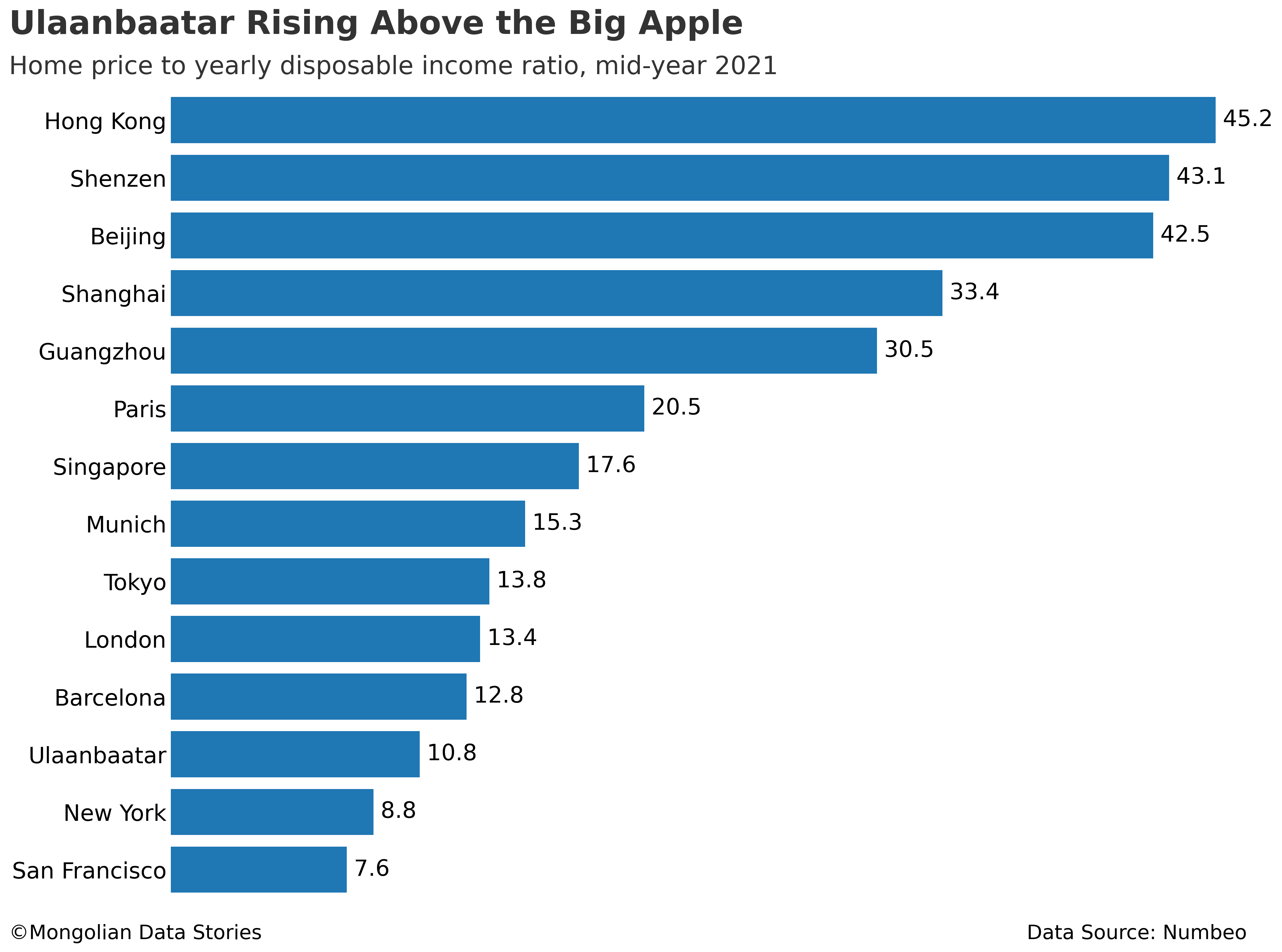
Being towards the bottom of the chart, Ulaanbaatar does not look too bad next to the ultra expensive cities in China. But look at the two cities Ulaanbaatar is more expensive than in this list. New York and San Francisco!
Siri, recalculate that for me
Let’s take a step back. How sure are we that these numbers are accurate? Using local and reliable data sources, I wanted to calculate the price to income ratio to verify that the result from Numbeo is accurate.
Digging around for data, there are a few issues with the price to income ratio as calculated by Numbeo. First, it is not clear whether Numbeo is using average or median salary in its calculation. In Mongolia the median salary is substantially less than the average salary.
This is due to a small number of high earners skewing the average higher while the median (or middle) salary is lower. While average salary data are available for both Ulaanbaatar and the national level, data for median salary are only available at the national level from the National Statistics Office of Mongolia.
It is also important to note that generally when a median is much smaller than an average, the mode (the most common observation) is generally even smaller than the median. Given these facts we probably should not consider the statistically average Mongolian to actually be very average at all.
The second issue is related to the price per square meter of housing. In countries like the United States the average price of housing would include apartments for purchase, smaller multi-family dwellings, and single family units. In Ulaanbaatar, when the price of housing is discussed it almost always refers to the price of apartments, not single family units. Yet 50% or more of the population of Ulaanbaatar does not live in apartments. So any ratio we make with the available data would be limited in scope to apartments and not the full spectrum of housing available in Ulaanbaatar.
With these issues in mind we can calculate a price to income ratio using available data. I used the same formula as Numbeo to keep things consistent.
- Average Ulaanbaatar salary for Q2 2021 via 1212.mn: 1,433,100 MNT
- Average price per square meter of apartments for Q2 2021 in Ulaanbaatar via Doljoo from Tenkhleg Zuuch on Twitter: 2,647,076 MNT
- 10% Income Tax + 13.5% Social Insurance = Tax rate of 23.5%
Putting it all together we can take the average price per square meter multiplied by 90 square meters to get the average price of an apartment. Then we take the monthly net salary (average salary minus taxes) and multiply it by 12 months. Then multiply by 1.5 to get the estimated family income. All together:

The result? 12.07. This is a bit above the Numbeo ratio, but not by much. We should consider their number reasonably accurate given the issues we outlined above. Put simply, the “average” Mongolian family, which isn’t actually very average, will pay more for an apartment in relation to income than an average family in New York or San Francisco.
90 Square Meters? You rich bro?
If you keep up with things in Mongolia, you will know there is also an issue with using the assumed 90 square meters for an apartment. First, the government mortgage program allows a maximum size of 80 square meters. Second, a 90 square meter apartment is considered to be on the larger side for many in Ulaanbaatar.
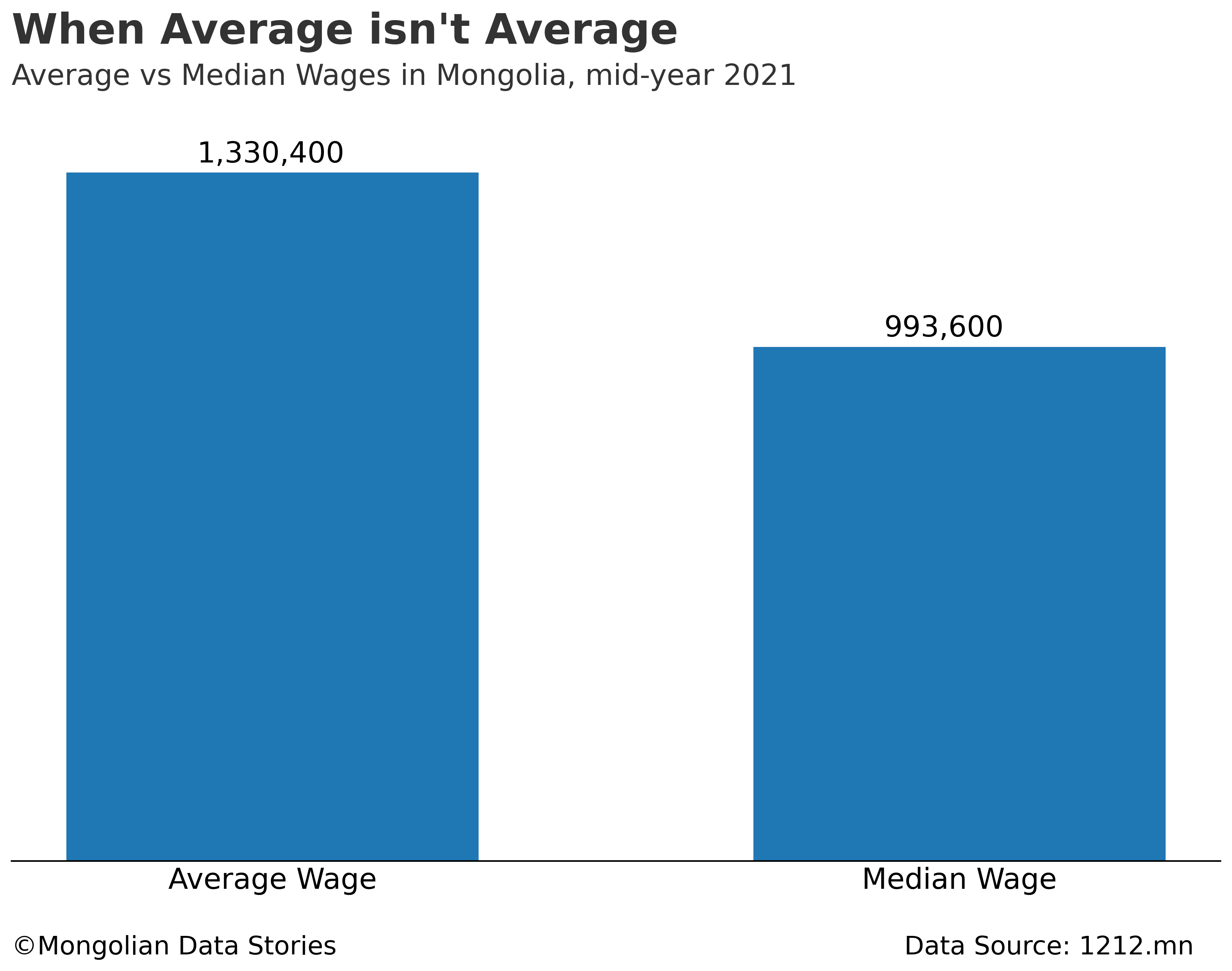
To address these issues I decided to take another pass at the price to income ratio using more realistic numbers for Ulaanbaatar. Here are the data assumptions I used.
- Median salary, national level, Q2 2021, via 1212.mn: 993,600 MNT
- The same average price per square meter for apartments, Q2 2021: 2,647,076 MNT
- 10% Income Tax + 13.5% Social Insurance = Tax rate of 23.5%
- Average apartment size: 62 square meters
- Tenkhleg Zuuch currently considers this the median apartment size in Ulaanbaatar.

The result? 11.99. Nearly identical to the ratio calculated above with average salary and 90 square meters. We can’t directly make a comparison now to New York or San Francisco like we did before. What we can do is draw a general conclusion about apartment affordability for a middle income family for a median sized apartment.
Note: You might think we could simply take the ratio from New York and multiply it by 1.3 (because 62 square meters is about 30% less than 90 square meters). Without knowing whether Numbeo used median or average salary in all circumstances it’s hard to know if we can make a generalized estimate like that.
But what comes next might be more useful.
Zoom in, enhance!
After doing the above calculations I felt that I still had not gotten the full context of the situation. I realized what we needed was a look at the trend of the price to income ratio. In other words, have apartments gotten cheaper or more expensive relative to wages over the past several years?
Luckily I had apartment price data and wage data from 2014-2021. Here are the data assumptions I used to gereate the chart:
- Yearly net salary = Average salary (national level) x (1 - tax rate) x 12
- Average apartment price = Average price per square meter in Ulaanbaatar x 62 square meters
- Price to income ratio = Average apartment price / Yearly net salary
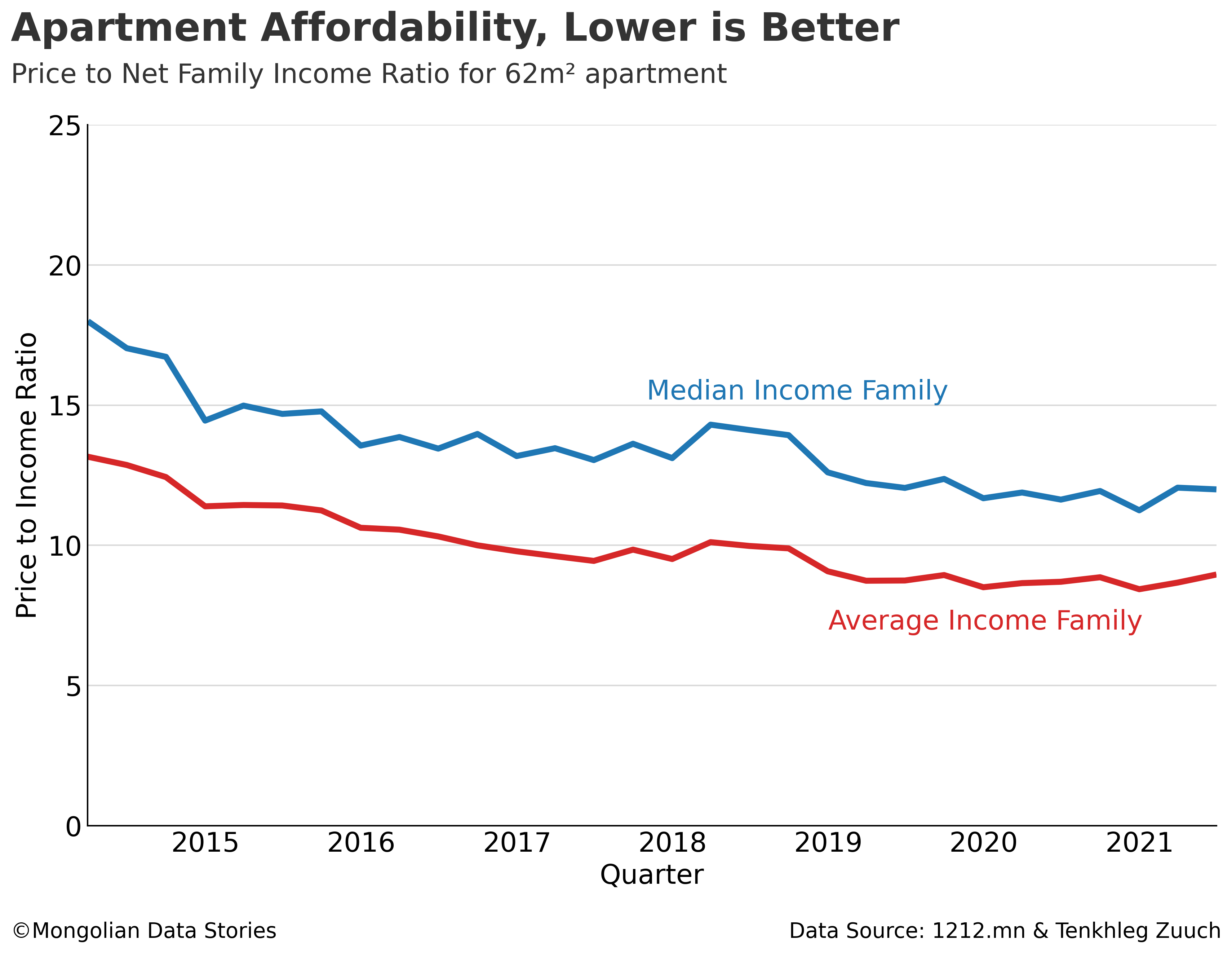
I was fairly shocked by the result. I always heard that families are being priced out of apartments, but this chart tells a different story. In the past 10 years apartments have become more affordable to both average and middle income families. Since around 2019 the trend has leveled off, with salaries and apartment prices rising at a similar rate.
This seems to signal that more recently supply and demand has reached some sort of balance, with the supply of apartments matching the demand in the market.
Does this mean that apartments are “easy” to afford for families? That’s a tougher question that leads us into mortgage territory and the unique properties of the lending market in Mongolia.
We can leave that for another day.
Mongolia is running on fumes

Just yesterday I learned that there has been a gasoline “shortage” for a few weeks in Mongolia. I put shortage in quotation marks because it seems the government and average citizens did not immediately agree on the reality of the situation.
On September 14, 2021, the Mineral Resources and Petroleum Authority of Mongolia made a statement via the state news agency Montsame unequivocaly stating that there is no shortage of gasoline. This is heavily contrasted by reports on social media of limitations on purchases or outages at some stations.
Хил гааль дээр хэдэн сараар гацсан бараа таваараа татаж чадахгүй, хэдэн колониуд нь бензиний нөөцөө барсан, ковидоор өвдсөн хүмүүст нь эмнэлэг олдохгүй, дарга эрх мэдэлтнүүд нь эзгүй.... бид дижитал үндэстэн pic.twitter.com/2xxAd3ha80
— Seku (@ganaasel) September 20, 2021
So what is the actual situation currently in Mongolia? As usual, I like to go to the actual data to see what the reality is.
Fuel Reserves
The Mineral Resources and Petroleum Authority of Mongolia (MRPAM) reports fuel reserves on a monthly basis, and has these reports going back to 2015. Unfortunately the reports are in PDF form, requiring a bit of copy pasting on my part to collect the last two years of data.
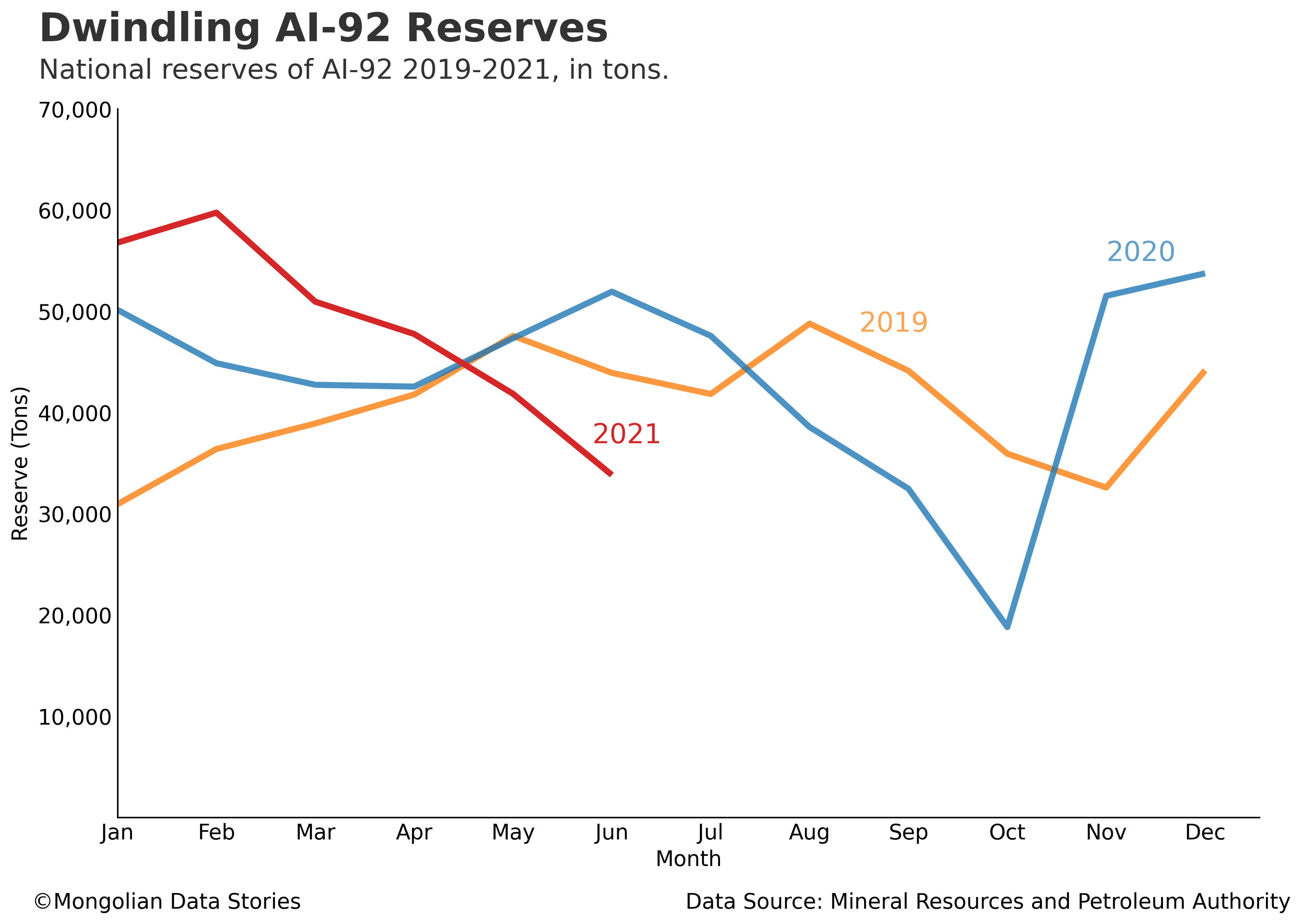
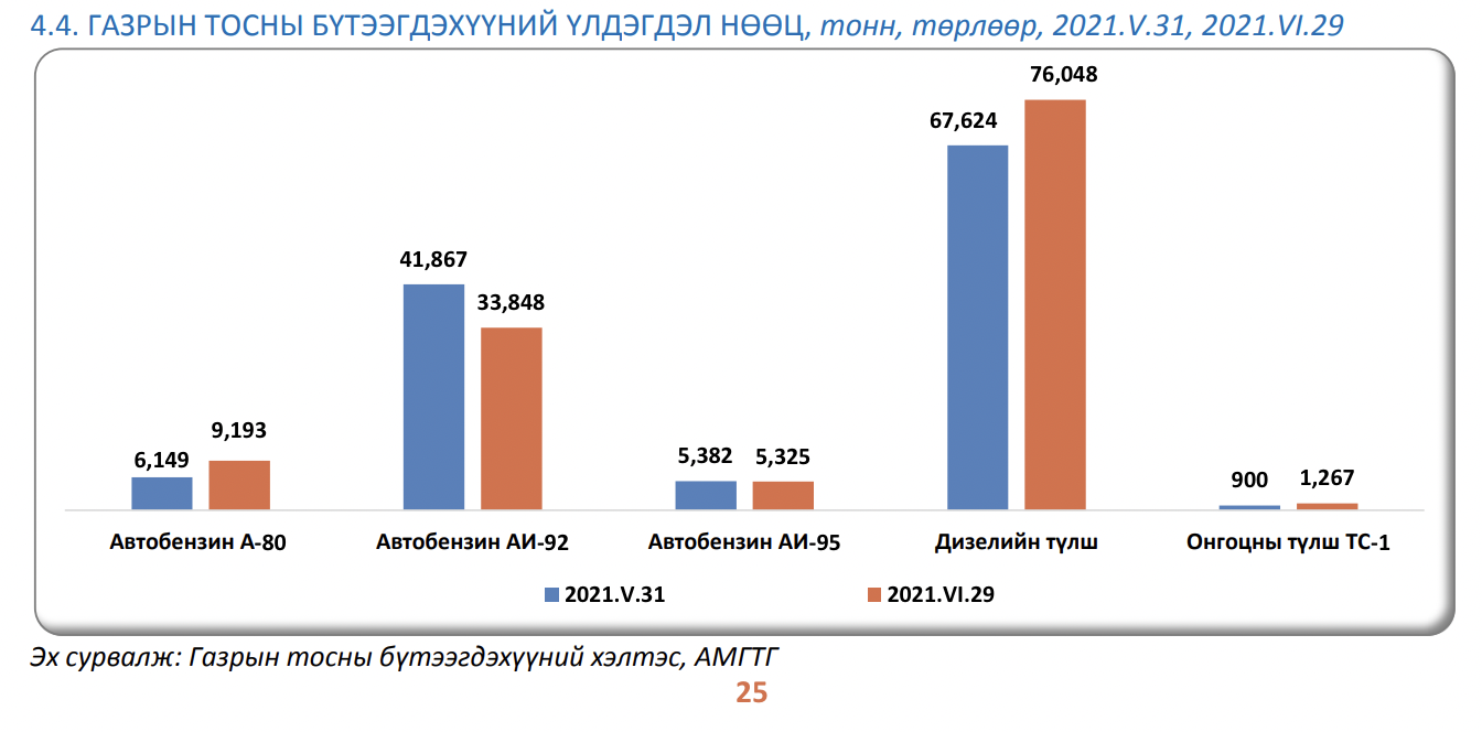
We can see that the reserves of AI-92 fuel as of June 2021 are nearly 35% less than June 2020. It is also clear that during the fall reserves are reduced, most likely due to increased vehicle usage as people return to work from their summer vacations.
As far as I can determine the government has not said anything definitive about when imports of AI-92 slowed or stopped. The government did release some information about further dwindling reserves today (September 21, 2021), stating the central region has 4 days of fuel remaining. Other than a mention that no AI-92 fuel will be imported in September, it is not clear what the current import situation is.
Note: I chose to visualize AI-92 fuel as it is the most common fuel used in passenger vehicles in Mongolia. It is also the type of fuel nearly everyone is complaining about shortages of.
Reporting Irregularity
Typically, the MRPAM posts the reserve statistics one month delayed, but it seems this year they have neglected to post any reserve statistics since July 22nd. By now we should be able to expect the reserve numbers for July and August to have been posted. As of the time of publishing, the government still has not released reserve or import statistics for July or August 2021.
In addition, an irregularity in the reporting popped up as I was going through these monthly reports. On all monthly reports, the MRPAM shows a yearly comparison on the fuel reserve chart, for example showing January 2021 vs January 2020. This allows the report reader to see how the reserves land year over year. This is a good comparison as consumer behavior follows a yearly pattern.
The latest report for June 2021 made a departure from this. Instead of showing a year over year comparison they compared June 2021 vs May 2021. This made the numbers look better on the chart, and conveniently hid the nearly 35% reduction in reserves year over year. The screenshot below from Page 25 of the June 2021 report shows this departure from the usual practice.
Fuel Reserve Projection
Given today’s announcement by the government, we know that the central region of Mongolia has only 4-5 days of fuel remaining. Nevertheless, it may be useful to understand how a fuel reserve projection could be made given imports, reserve numbers, and inferred usage.
MRPAM releases import numbers by fuel type alongside the reserve numbers.
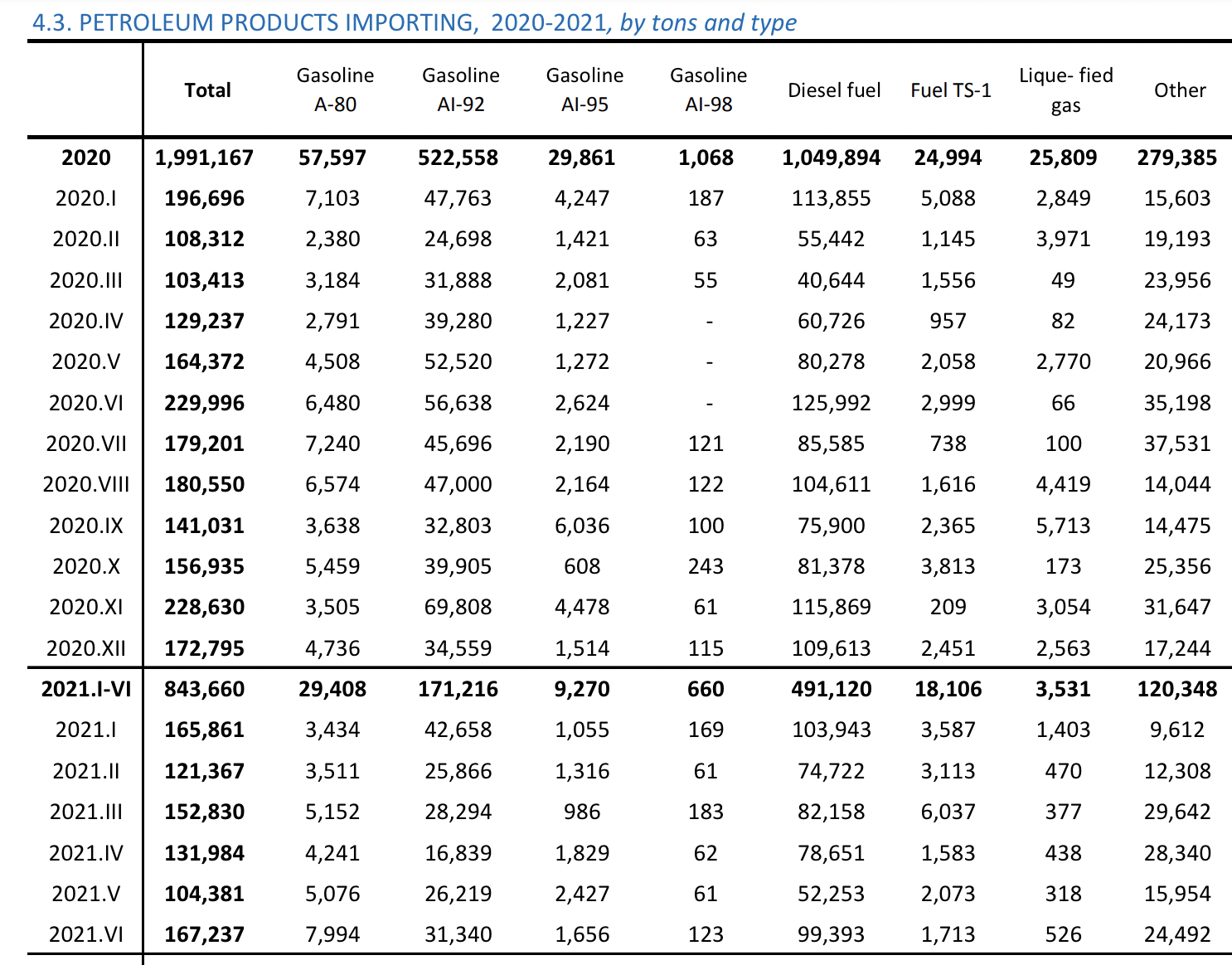
A few minutes of copy pasting later I was able to create a nice table with reserves and imports for AI-92. I then took the previous months reserves, added it to the current months imports, and subtracted the current months reserves. This should give us a reasonable estimate of actual usage of AI-92 during that month.

We can also determine the available reserves at the end of the month given a very similar formula.

To extrapolate forward I looked at several different import scenarios where the imports are a percentage of the values from 2020. We will forecast forward using 75%, 85%, and 95% of the import levels from July 2020 to December 2020. We will assume the same level of fuel usage from July 2020 to December 2020.
Stepping forward each month we can do the process listed above and get a projection of AI-92 reserves at the end of each month for each of these scenarios. Keep in mind the projection below assumes 2020 levels of consumption and are based on a percentage of imports from the corresponding month in 2020.
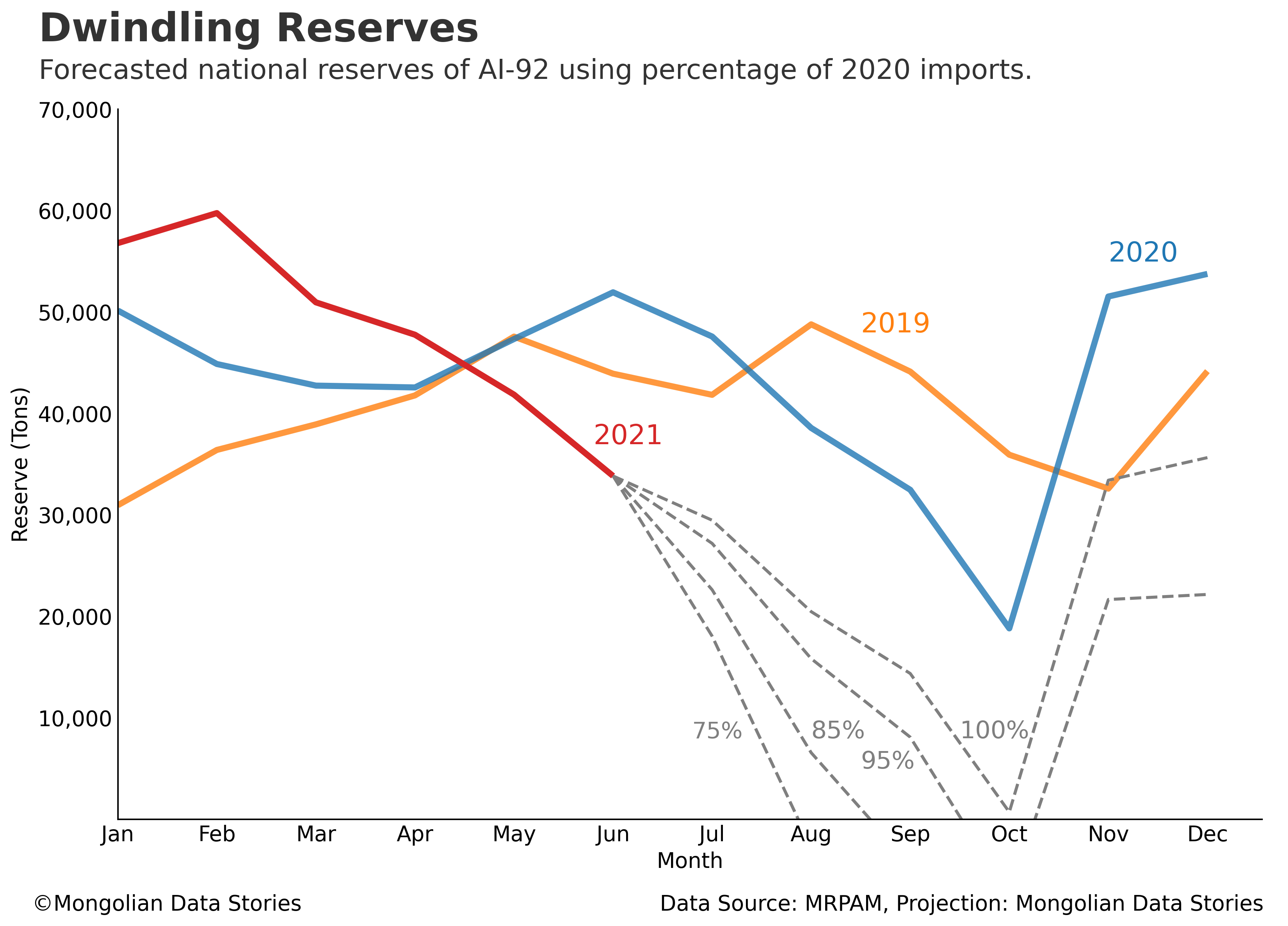
At 85% of 2020 imports we see reserves emptying in September. At 95% reserves go negative in October and rise again positive in November. Only at 100% of 2020 import levels do the reserves stay above 0. The already lowered reserves from late summer seem to be exacerbating the current import issues.
It is very clear that without imports equal to or larger than 2020 Mongolia’s AI-92 fuel reserve will continue to be near zero for a few months. Of course these projections aren’t a guarantee of what will happen. They are merely scenarios based on past data that we can use to better understand the current situation. I hope you find them useful.
Hiding Risk
It seems fairly clear from the analysis above that the current shortage of fuel could have been seen as early as July/August this year. Reserves were so far off their usual level that it was a clear signal of risk. Of course this was a sensitive time politically as back to school preparations began. The government seemed to clearly be trying to exhibit a sense of stability and preparation ahead of the usual fall rush in the city and around the country.
It is important to remember that in December 2020 Mongolia had a large opportunity to significantly increase coal exports to China. China recently banned the import of coal from Australia, giving Mongolia an obvious advantage. Due to COVID-19 outbreaks and customs issues, Mongolia seems to have squandered that opportunity.
Mongolia's $150,000 license plate

Would you pay this much for the country’s “best” license plate?
TL:DR Mongolia auctions off a “lucky number” license plate and the bids reach 427.45 million MNT (Mongolian Tugriks) in less than three hours. That’s $150,035.10 USD at current exchange rates.
Numbers mean a lot to most Mongolians. Generally, 1, 3, 8, and 9 are considered “lucky” numbers. Mongolian phone numbers have 8 digits, and the first 4 of these numbers can tell you a lot about who is calling you. So-called “lucky” phone numbers beginning with 99 or 88 regularly sell for anywhere from $1,000 (9999-XXXX) up to $20,000 or more for the most elite (9911-XXXX). These phone numbers are sold on the “secondary market” from person to person. If a 9911-XXXX number calls you and you don’t answer, expect them to be upset…
Unfortunately, license plate numbers are assigned to a vehicle and can’t be transferred between individuals. In addition, up until recently, you couldn’t pay for a better license plate number. This caused a situation where the “best” license plates (think 0001-УБА) somehow ended up on Mercedes G-Wagon’s and Land Cruisers. I wonder how that happened?
 The G-Wagon. Source: Wikimedia Commons
The general public always knew what was really happening. At one point frustration was so high that there was discussion of giving these lucky numbers to garbage trucks or other city vehicles. It seems their voice was heard when the new Motor Vehicle Registration Country Number Procedure was approved in late 2020. This procedure set up a system to allow “lucky” numbers to be auctioned on the Vehicle Registration Department’s website. This has been generally viewed as a positive development, as those willing to pay for this special license plate could pay legally for the privilege and contribute to government revenue and social programs.
I’m not sure anyone expected what happened next. On February 15, 2021, the number 0001-УАР had its day to be auctioned. The first bid was 1,000,000 MNT (approximately $350 USD). Let’s see what happened…
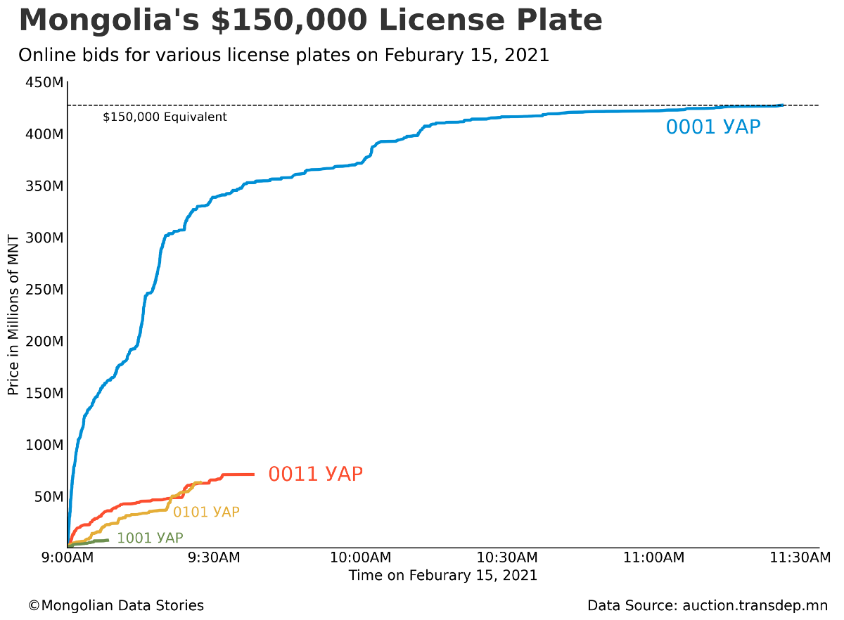
Cumulative bids for various license plates on February 15, 2021. Source: Author
The auction opened at 9:00AM. In less than 30 minutes bids for 0001-УАР reached the equivalent of $100,000. By 11:30AM the auction total reached 427.45 million MNT (Mongolian Tugriks). That’s $150,035.10 USD at current exchange rates.
Anyone bidding on a license plate number is required to put in a deposit for their bid of 50,000 MNT (about $17 USD). There were 957 bids for 0001-УАР. Those who didn’t win the auction will have their deposits returned. The winning bid is now expected to pay the total amount. If they don’t pay or are unable to, this number will go up for auction again.
It’s unclear how much of this auction was real interest or social media hype, as this particular license plate went somewhat viral on various Mongolian language Facebook groups. To put things in perspective, the average yearly salary in Ulaanbaatar, the capital, is about $5,300 USD.
What do you think? Is a $150,000 license plate worth it?
Is Australia's Loss Mongolia's Gain?

Note: This article originally appeared on Mongolia Weekly.
Typically, towards the end of each year China’s coal imports decline, only to restart with vigor early the next year. Argus media, a media organization focused on commodities, say that this slowdown, officially blamed on customs clearance issues, has happened for the past two years. Of course, this official explanation has shown a remarkable regularity at the end of the year when China has mostly satisfied its domestic need for coal. In both 2018 and 2019 around November, a line of coal trucks kilometers long would sit at Mongolia’s southern border with China in below freezing temperatures waiting to be processed.
As early as November, New Hope, and Australian coal miner, said they believed Australian coal imports were simply being delayed until January. Yet this year seems to be different. The recent trade spat between China and Australia has resulted in China eliminating clearance restrictions from several countries, except for Australia.
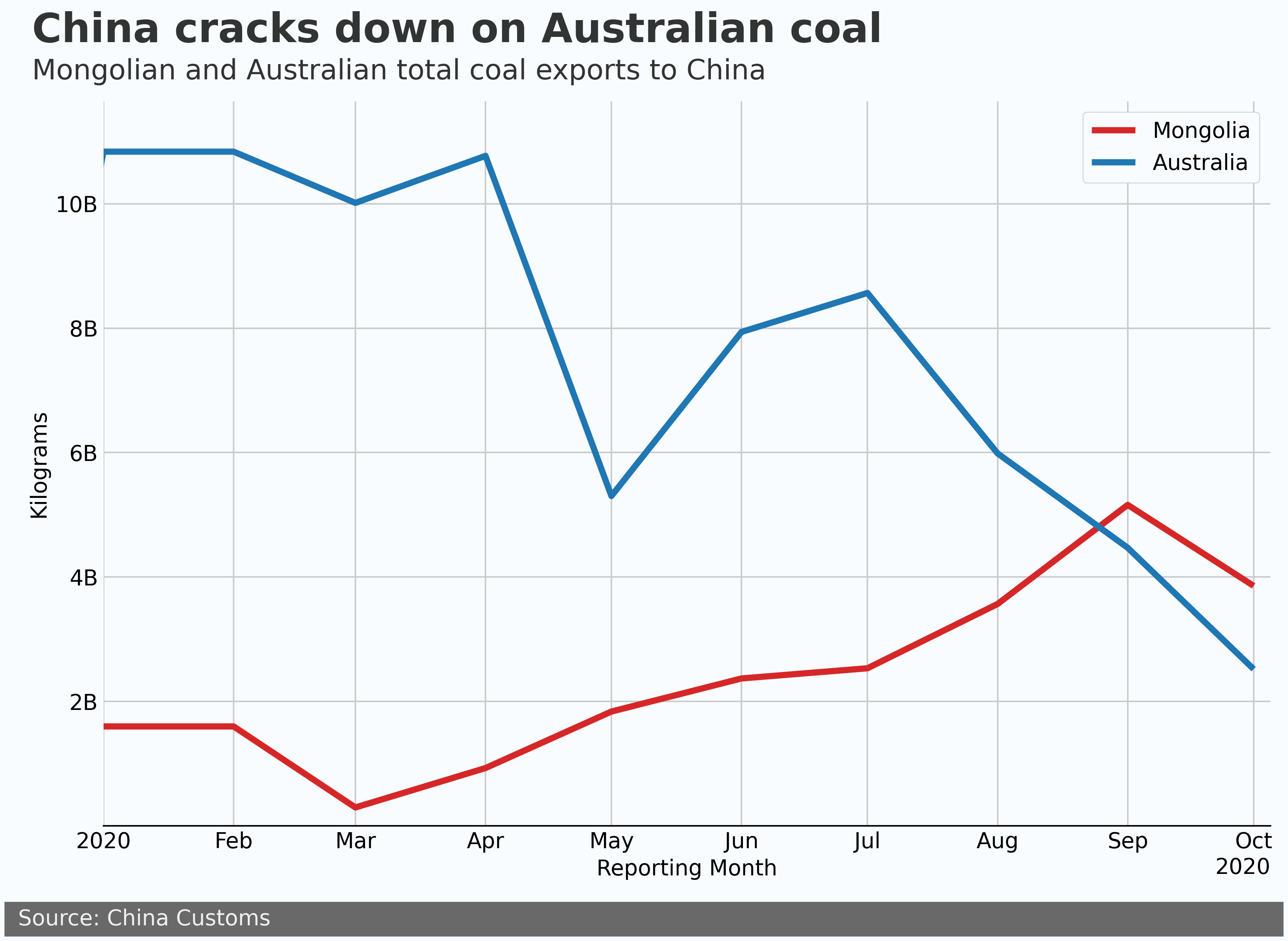
Since July, Mongolia’s coal export has been ramping up and trying to make up ground that it lost due to coal exports dipping to near zero in March. Mongolia’s Finance Ministry stated in 2019 that mining revenues made up 27% of the state budget. In addition, prior to just a few days ago Mongolia might have been looking at a hard slowdown of customs clearance for coal exports at the border in November. This race to the finish has not been kind, with total mineral products exports down $10.7 billion USD at the end of November, year over year, according to the National Statistical Office.
While the spat between Australia and China would seen to be an opportunity for Mongolia, it is important to keep in mind the type of coal that Mongolia predominantly exports to China. Since 2019, 85% of Mongolia’s coal export to China has been coking coal, which is used in blast furnaces as part of the steel production process. During the same period, only 42% of Australia’s export to China is coking coal, with a large portion of the rest being used for thermal coal to generate electricity and heat.
Nevertheless, for the past few years Mongolia has been running up against China’s de facto coal quotas. With Australia sidelined, Mongolia has a significant opportunity to ramp up coking coal exports.
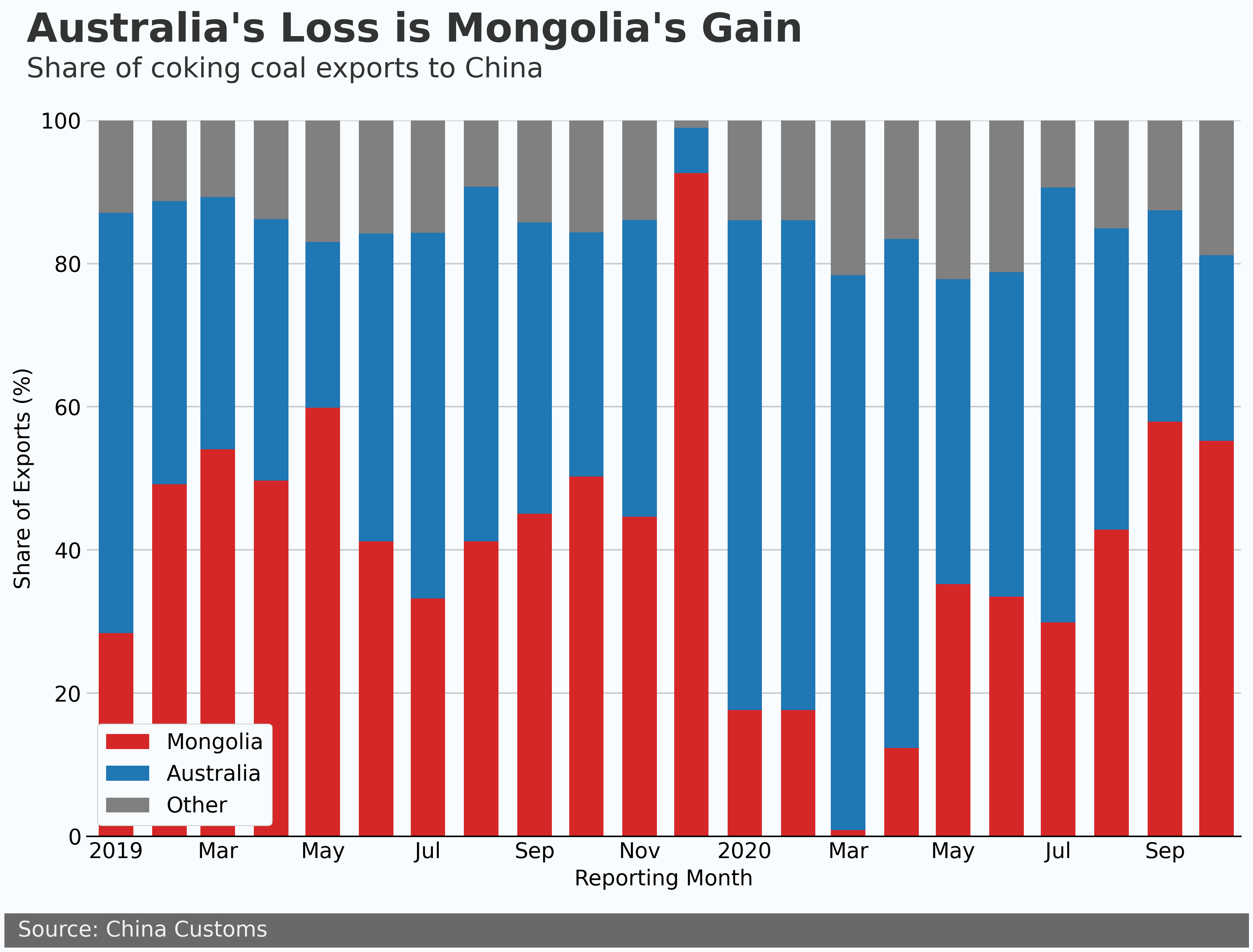
In 2019 Mongolia’s share of coking coal exports hovered around 50% of China’s total import. In 2020 Australia filled the gap left by Mongolia and in March accounted for nearly 80% of China’s coking coal imports. Now it is Mongolia’s turn to fill the gap. If Australian coal imports remain stranded at sea, Mongolia could increase coking coal exports significantly in the near term.
Challenges remain for Mongolia. Currently coal is still trucked to China, and the under construction Tavan-Tolgoi Gashuunsukhait railroad is scheduled to be completed in 2022. This railroad will improve margins by reducing transportation costs and speed customs clearance, which will result in higher revenues and increase export ability. Until then, the main bottleneck is still customs clearance with China.
The recently opened “green channel”, which optimizes clearance of cross-border freight and related personnel, has been said to help. Yet due to the recent outbreak of COVID-19 in Mongolia, China insisted truck drivers entering the country be tested before being allowed to cross the border. Currently there is a big opportunity in front of Mongolia, and we will see early in 2021 if it can take advantage of it.
Mongolian Electoral District Analysis 2020
2020 Parliamentary Election
The current election saw a switch back to the block voting system used in 1992 and 2008. This system has both positives and negatives, and this system has much larger election districts than the previous single-member districts of the 2016 election. This allows us to more easily analyze the districts with the available data.
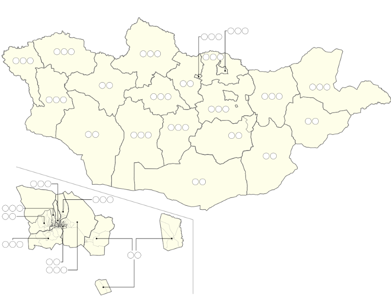
To put all of the data together and make it user friendly, I built an interactive data explorer that allows the reader to see key indicators of election districts. The indicators covered in the app include:
- Population indicators: population, household size, herder percent, age group breakdown
- Economic indicators (self-reported): salary, household loans, employment, education levels
- Quality of life indicators: crime, house type, toilet & water type, heating type
The data was collected from 1212.mn and also the Household Socioeconomic Survey of 2016, which is the latest survey that contains precise geographic labeling. Both data sources are maintained by the National Statistics Office of Mongolia.
Several themes developed through my research into this data. These themes are perhaps not surprising for many readers familiar with Mongolia, but it is never a bad thing to back up observations with data. Below I give an overview of the themes for your convenience.
Ulaanbaatar vs Countryside
Perhaps the best-known difference in Mongolia is that of Ulaanbaatar and the countryside. The image of busy urban Ulaanbaatar juxtaposed with the bucolic countryside could hardly be more different. Indeed the data shows significant differences in many areas. Let’s compare the population pyramid for the election district with the highest population, Songinokhairkhan District in Ulaanbaatar, with the least populace, Bulgan Aimag.
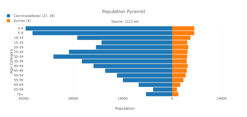
There is an obvious population difference, but the size of the age groups also shows a marked difference between the two. Where you have a large spike in the 20–40 age group in Songinokhairkhan, Bulgans' age groups have much less variability and are quite flat from 15–50. You will see a similar trend in the highest population election districts compared with the least populated ones.
This means the voting demographics in rural areas are more widely distributed than in urban areas. D.Byambjav and E.Gerelt-Od previously discussed the large and less engaged block of voters under 35. If youth engagement initiatives are successful, this block of voters will be less powerful in rural districts that have a similar age distribution to Bulgan.
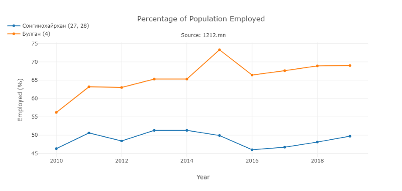
Employment differs significantly as well between Ulaanbaatar and most rural districts. Rural election districts tend to show significantly higher rates of overall employment than the urban ones. In the chart above, the “employed percentage” refers to the proportion of the working-age population that is employed. Urban districts tend to have between 45–55% employment, with rural districts between 65–75%.
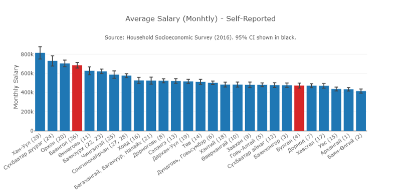
Salaries are also significantly higher in Ulaanbaatar. The salaries shown above are self-reported from 2016, but they show a very clear picture. Employment levels may be higher in rural areas, but salary levels are conversely lower. This is an obvious area where the economic policy of the party platforms could address these inequalities.
Outliers: Mining Areas and Bayan-Ulgii
The Ulaanbaatar vs countryside theme may be the biggest theme in the data, it doesn’t give the full picture. There are two sets of outliers that “buck the trend”.
The first is that the two primary mining areas of Mongolia, Erdenet (in Orkhon) and Oyu Toloig (in Umnugovi), show significantly higher salaries, lower loan rates, and higher educations than other rural election districts.
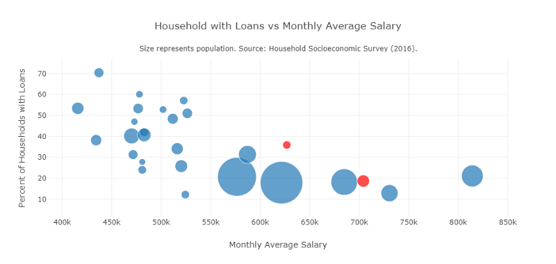
This bubble plot shows the percent of households with loans vs monthly average salaries in each election district. The two highlighted in red are Orkhon (lower right) and Umnugovi (upper left). All of the bubbles above 550k average monthly salary except for the two in red are located in Ulaanbaatar.
These two election districts (and the urban workforce where the company offices are) have benefited heavily from the mining industry of Mongolia. Industrialization as proposed in the party platforms would most likely further benefit these areas, as this is where the raw materials would come from.
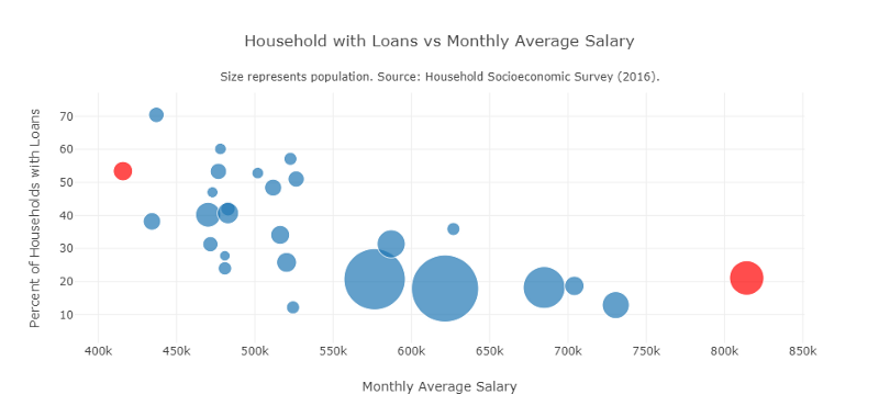
The second outlier is Bayan-Ulgii. In the chart above, the red bubble to the farthest left is Bayan-Ulgii, and the red bubble on the far right is Khan-Uul District. The average household size is 5.2, significantly larger than the most populace district Songinokhairkhan of 3.8. Besides larger family sizes, Bayan-Ulgii has the lowest average monthly salary.
Ulaanbaatar Districts Have Diverse Needs
The districts of Ulaanbaatar also show diverse needs. Every district also contains part of the ger district. This means that there is a mix of urban and peri-urban in every election district of Ulaanbaatar. In the center of the city, households are connected to the central water, heating, and sewage systems. In the ger district, living standards become sharply different, with no central heat or water connections.
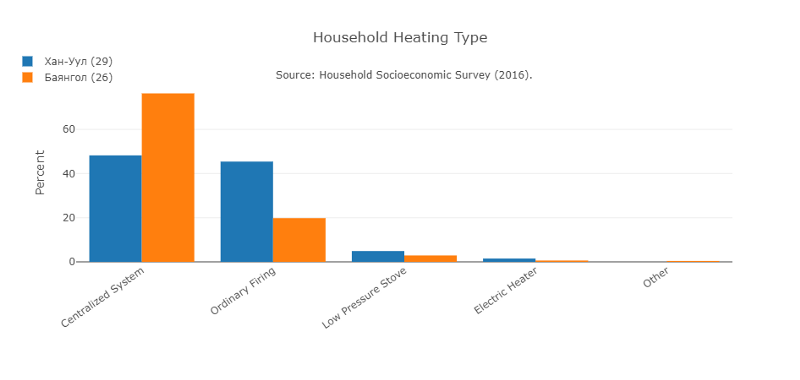
The unique layout of the city districts ensures that at least 20% of the population of each district uses pit toilets and wood or coal for heat. More than 40% of Khan-Uul district households, the most affluent election district in Mongolia, use ordinary wood and coal stoves for heat.
MPs Will Represent Very Diverse Groups
Regardless of the outcome of the election, it is clear that the needs of citizens in election districts are not uniform, and even the common trope of UB vs the rest doesn’t hold up completely. Even though Mongolia a small country with a heavy focus on mining, it isn’t clear that the party platforms address the inequalities mentioned above.
While the economics platforms of the DP, MPP, and Right Person Electorate all focus on heavy industry, it isn’t clear how heavy industry would help rural areas outside of the main mining areas lacking in high paying jobs, or whether it would increase employment levels in Ulaanbaatar.
Sqair Air Purifier Real World Test

I put the new Sqair air purifier from Smart Air to the test in a controlled experiment
Note: I was loaned a test unit, and I did not receive any payment or renumeration from Smart Air for this article.
Winter is coming, and we know what that means in Ulaanbaatar. Extremely high levels of air pollution. Even with the recent ban on the burning of raw coal it is possible (even likely) that levels of the particularly dangerous pollutant PM2.5 will remain high during the winter months.
During these months a pollution mask and air purifier are essential equipment to protect yourself and your family. Air purifiers can cost anywhere from $150-$500 or more. This means many families choose to forgo air purifiers completely, at the cost of their entire families health. Smart Air, a social enterprise founded in 2013, wants to change this situation with the launch of their new no-nonsense air purifier, the Sqair. Funded through a Kickstarter campaign in June, the Sqair purports to be the world’s most cost effective air purifier.
 Top view of the Sqair. Simple rotating controls.
 The Sqair in our small 10m² test room.
Sqair was kind enough to lend me a unit for a few days to test it out. I’ll first give my general thoughts on the device and then present my experiment to show how effective the Sqair is at removing PM2.5 from a room.
I was very pleased with the look of the device as it didn’t stick out as much as other air purifiers (the IQ Air purifier looks like an industrial battery). The controls are dead simple with three options: off, 1, 2, and 3. Fan speed 1 is very quiet (like very quiet). Fan speed 2 is certainly audible even in a room with a little background noise, but it easily blends in. Fan speed 3 is downright noisy, but as you will see below there isn’t much need to use this speed unless you are looking to really move some air through the machine.
The Experiment
One thing I really wanted to test was how effective the Sqair is at clearing pollution from a room. I’ve heard criticism about air purifiers from several people who are skeptical of how well they circulate air. The common question is, “How do I know it isn’t just cleaning the air in one corner of the room?”. So I set up an experiment to see how well the Sqair works.
At my school we have a quiet study room that is 10m² and has ceilings of 3 meters. That makes 30 cubic meters of air in the room. The room has a door that seals completely and has no air vents. This made the perfect room to conduct an experiment with an air purifier. The only problem is that in early September there is essentially no air pollution outside, and inside PM2.5 levels hover around 5 µg/m³. So I had to get creative and make some air pollution.
 Timelapse camera pointing at a laser PM2.5 sensor.
 Artificial pollution source (арц).
In Mongolia арц (ground Juniper leaf) is commonly burned for religious purposes. It turns out it also is a great source of PM2.5! I poured a few grams of the green powder in a cup and lit it up. The sensor I was using maxes out around 1,500 µg/m³, and after only a few minutes of burning it reached the max! Keep in mind that air is considered “good” by the US EPA if the PM2.5 level is below an average of 12 µg/m³ over 24 hours (the Mongolian standard states that the air is clean below an average of 50 µg/m³ over 24 hours)
I used the following process to run the experiment:
- The air purifier and air quality sensor were placed on opposite sides of the room.
- Burn the арц for a few minutes until the PM2.5 level spikes.
- Set the air purifier to a speed.
- Wait for 90 minutes while the camera records a timelapse of the air quality sensor.
- I also ran a separate test with the air purifier off for 90 minutes to set a baseline.
The results were quite amazing! It’s one thing to know that your air purifier is keeping your air clean, it’s another to see it working in real-time. Let’s take a look at the results:
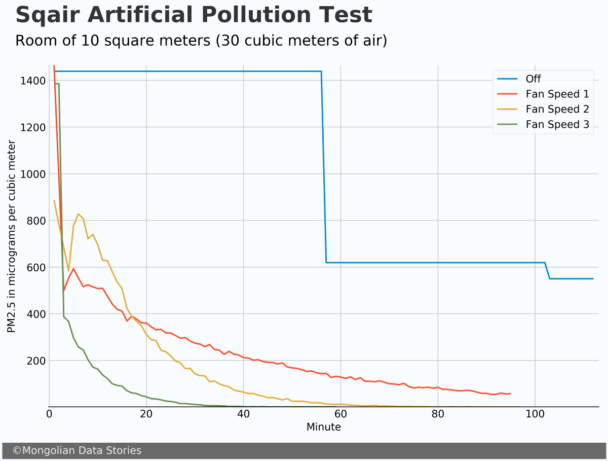
Before running the test I was quite concerned that the very very quite speed 1 wouldn’t circulate the air enough to clean the room’s air. It turns out that even on fan speed 1 the air was being cleaned at a very steady rate.
During the fan speed 2 test, it seemed the air was moving around quite a bit more, and for a brief time, the PM2.5 levels went down and then up again. The fan speed 3 test was almost comical in how quickly the air was cleaned. I actually ended it early because I saw no use in continuing it after 60 minutes.
Overall the results were what I expected for speeds 2, and 3, but better than expected for speed 1. In a larger room, fan speed 1 may not circulate air enough to clean it well. However, this will depend greatly on the room and I couldn’t give a definitive answer based on my test.
Conclusion
I was quite impressed with the simplicity, effectiveness, and cost of the Sqair. It just works and it does so while looking good and not breaking the bank. I can easily recommend these air purifiers to anyone looking for a simple and cost-effective solution.
If you are interested in buying a Sqair or learning more about Smart Air check out their website here.
Mongolian Meat Price Time Series Forecast
In the land of eternal blue skies and nearly 70 million animals, meat is getting expensive
Since September 2018 the average price per kilogram of mutton in Ulaanbaatar has increased by 35% (beef increased 26%). News outlets have been buzzing with talk of these price increases and even meat shortages. Headlines from many news outlets make it seem as if the sky is falling (see below for a particularly sensational headline from Ikon.mn). I hope to explain the market forces at play here and hopefully better understand why prices are at record highs.
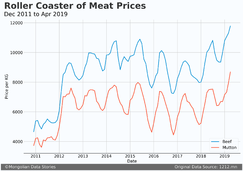
Time series of beef and mutton prices from 2011 to 2019.
How Meat Works in Mongolia
In Mongolia, meat prices are highly seasonal, with meat prices rising in the Spring and then falling in the Fall. The meat supply itself comes from nomadic herders who make up roughly 30% of the population. But these herders do not operate with anything resembling a western mode of production. Their behavior has more to do with herd health and preparations for the various challenges of each season.
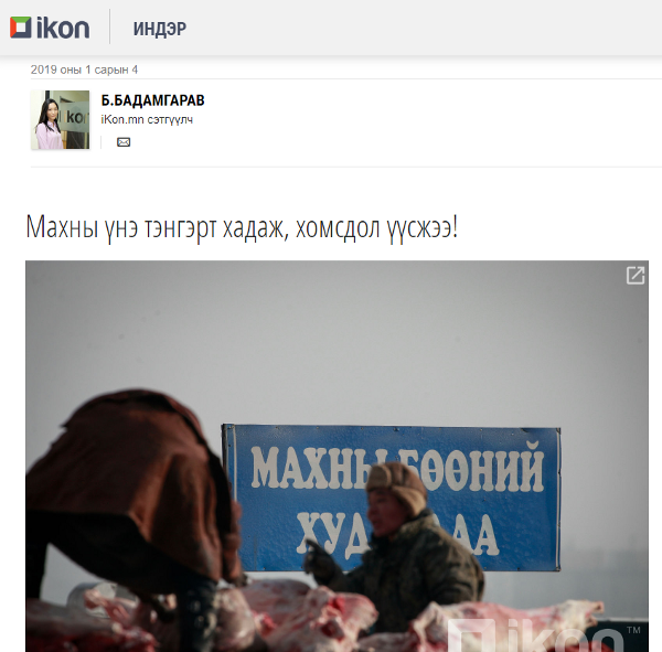
In the opinion section of Ikon.mn. Headline translation: “The price of meat is skyrocketing and there is a shortage!”
Here is a rough generalization of the behavior of herders. This, of course, does not speak for all herders but from what I have observed this is relatively typical behavior. In the Fall before winter sets in herders will slaughter or sell those animals which are likely to die in the coming winter. Then in the Spring during breeding season herders often restrict the amount they sell so as not to limit their potential growth that year. In the Summer the productive animals are known and herders are more willing to sell or slaughter those animals that are not pregnant.
With this cycle, it is clear that seasonal prices are primarily being driven by the supply of meat. Prices go down in the Fall, hit the bottom in the Winter, and then rise dramatically in the Spring, reaching the peak in the Summer.
To ensure the supply of meat, the government purchases extra meat when prices are generally low and freeze it for use in times when supply is lower. This program has been going on for several years and the Minister of Food, Agriculture, and Light Industry recently stated they will increase the supply of this reserve meat on the market. However, based on available data it is not clear whether this program actually works or does not. This reserve meat is frozen for several months and, from what I have observed, is much less desirable in the market.
Are increasing exports causing record prices?
Now that we have a short introduction to how the market works in Mongolia, let’s take a look at the factor most are blaming for the price increases, exports. Recently I was interview on MNB World’s weekly news program. Through this, I learned of the concern that international traders (particularly from China) are being blamed for buying meat in bulk, thus causing a meat shortage and prices to rise.
To understand this better I wanted to see if meat prices correlated with exports. After all, meat exports are not a new thing in Mongolia. If these exports were causing a fluctuation in the price of meat we should see these correlations. So let’s take a look!
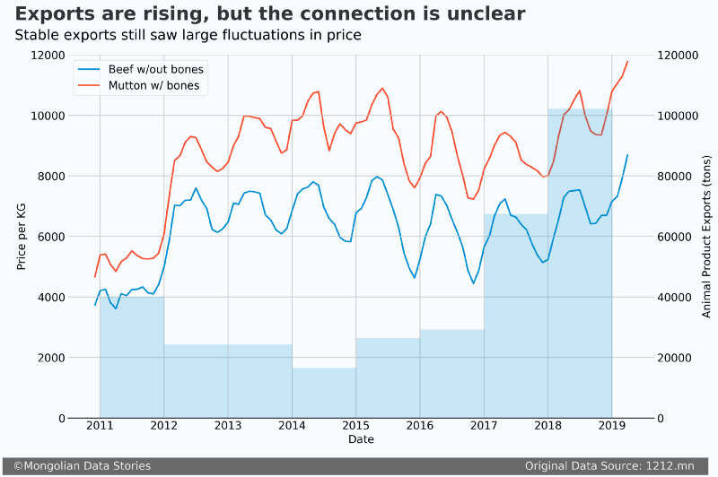
The blue shaded bar chart is animal product exports (in tons), and the two lines are beef and mutton prices (all prices in this article are Ulaanbaatar averages). As the chart title says, the connection isn’t clear. Export rose dramatically in 2017 and 2018. There may be a lag where 2017 exports impact prices in 2018 and 2018 exports impact prices in 2019, but this doesn’t make too much sense (meat goes bad after a few months being frozen).
In 2017 exports more than doubled from 2016, but average meat prices actually went down. We do see another dramatic increase in exports in 2018, but prices reached the same high from 2015. Simply put, exports may be causing prices to increase, but I do not believe it is the main driver.
Exports may be causing prices to increase, but I do not believe it is the main driver.
3.8% loss in 2018
There wasn’t much talk of dzud last winter. In fact, international NGO’s barely mentioned the fact that last year saw more adult animals die than any year since 2010. A total of 2.6 million adult animals were lost in 2018. Let’s visualize the adult animal loss and meat price.
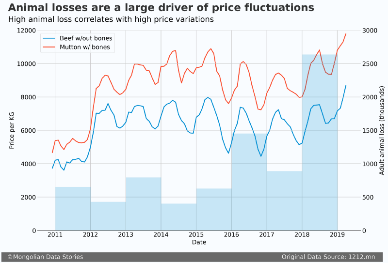
In 2010 over 10 million adult animals died. It was the last major dzud. Late 2010 then saw a dramatic rise in prices. I’m still unsure why we didn’t see a fast rise in prices. This was the same year Ulaanbaatar saw an explosion of people moving to the city. Perhaps them selling their herds caused a long enough increase in the supply to delay the rising prices.
Nevertheless, the large number of animals lost in 2018 is a very likely explanation for rising prices this Spring. Most likely both are responsible, as well as other external factors like rising salaries or fuel prices.
What happened to inflation?
Since 2010, the consumer price index (CPI) has gone up 84%. Annual inflation is somewhere between 6–9%. Given these numbers, it only makes sense that prices would go up. Yet since 2011 meat prices have been remarkably stable.
To illustrate this I took the monthly change in CPI from MongolBank and calculated what meat prices would be if they tracked inflation.
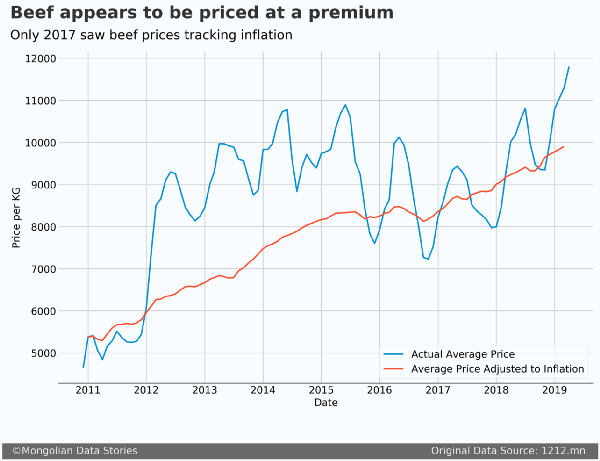
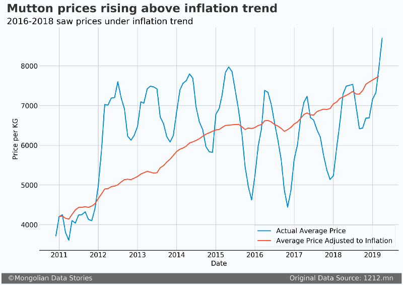
From 2012 to 2015 both mutton and beef trended above inflation. Then from 2016 to 2018 mutton was below inflation, with beef above. Now we see both again trending above the calculated inflation. What we can learn from this is that rising meat prices are not unexpected.
Prices go up because of inflation. If they don’t go up, but the currency value is decreasing due to inflation, that meat the real price of meat actually went down since 2012 when there was a large spike. This increase in price could simply be a reversion to the inflation trend that you would expect.
Mongolians are richer than they were 8 years ago
Also, let’s remember that since 2010 wages have also increased quite a bit. In 2010 the average monthly wage was 345,000 MNT in Ulaanbaatar. In 2018 it was 1,119,700 MNT. That is an increase of 225%!
Given the currently rising meat prices, do you think that the amount of money the average person spends on meat has gone up since 2011?
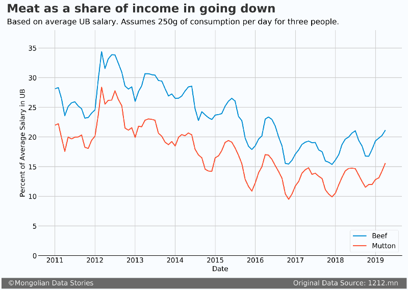
If you said yes, think again! Let’s assume that an ‘average’ person in Ulaanbaatar (making an average salary) has a family of three and each person eats 250 grams of meat per day (this is equivalent to the average US meat consumption per person in 2018) for a total of 750 grams of consumption for the family. Based on these assumptions we saw a reduction of around 7% for both mutton and beef as a percent of the average salary spent on meat.
The Tsuivan Index
To better understand the inflation of prices since 2011, I wanted to see how the price of other common items and service has changed. The National Statistics Office of Mongolia (NSO) has recorded the average price of common goods and services going back to December 2010. Below, I’ve created an index for a selection of goods and services by setting the December 2010 price as 100. If prices increase or decrease it will show as a proportion of the December 2010 price (i.e. 100). In this way, you can effectively see the percent change in prices since December 2010.
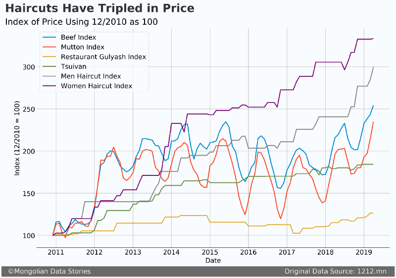
From the above chart, you can see that beef is about 250% more expensive (2.5 times) than in December 2010. Mutton is about 240% more expensive. What is interesting is the increase in prices for the other items. Here is a description of each:
- Restaurant Gulyash — This is the price of a typical goulash meal (including potato salad and tea) in Ulaanbaatar at a typical restaurant.
- Tsuivan — This is the price of a plate of Tsuivan (including milk tea) at a ‘tsainii gazar’, which is a canteen style of food establishment common across Mongolia.
- Men Haircut — The price of a men’s haircut in Ulaanbaatar.
- Women’s Haircut — The price for a ‘simple’ women’s haircut in Ulaanbaatar. For obvious reasons, they don’t track more complicated haircuts.
The most shocking price increases were for haircuts. Haircutting is a service business, and there is little in the way of materials needed other than the expertise of the person. In addition, haircuts are not imported and could be said to be a “Mongolian” product.
Of course, haircuts are of course not as necessary as meat for the average person, and haircuts can be performed at home. Other products like chips, Coca Cola, and other packaged foods aren’t tracked by the NSO, but based on my observations since 2012, they have increased significantly in price.
Becoming the Meat Price Prophet
I’m not a big fan of time series forecasts. They are generally too general and not accurate enough to truly understand a problem. Both times I tried previously didn’t give good results. But it seems that for meat prices it might not be too bad! Or is it?
Back in November 2018, I used Facebook’s Open Source Prophet library to forecast mutton and beef prices. For reference (and to show the limitations of time series forecasts), here are the forecasts.
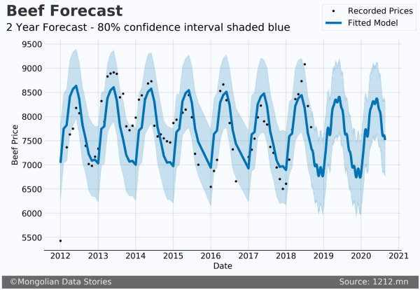
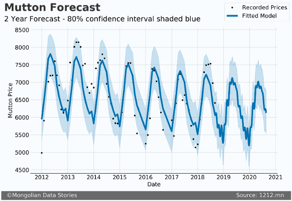
Based on these forecasts our predictions were quite a bit off. But these forecasts don’t take into consideration animal losses, exports, or anything other than the seasonal trends.
Prophet allows the addition of ‘regressors’, which are simply other variables that impact the prediction. What I did this time was take the previous years animal loss and added it to the model. In addition, I took the average yearly loss since 2011 (1.1 million animals) and assumed that would be the animal loss for the next two years. Here is the output of these two models, one for mutton and one for beef. I chose not to forecast other meat types as beef and mutton are by far the most popular.
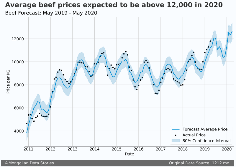
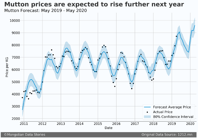
For each one the blue line is the average forecast, the black dots are the actual average prices, and the blue shaded area is the 80% confidence interval. The short story is that the peak price is almost over and we should expect a reduction in prices in June.
I expect that these forecasts are more accurate than my previous ones because it includes one of the primary drivers of price, animal loss. However, it will be important to add additional features if you wanted to get a more accurate forecast.
Conclusion
Intelligence agents “inspected” meat exporters. I assume they found meat.
Last week the General Intelligence Agency (equivalent to the FBI in the US) conducted a search of meat exporters warehouses. This implies there may be some conspiracy to raise meat prices or that exporters are hoarding meat to then sell back later at higher prices. This seems pretty ridiculous on the face of it.
Meat frozen more than a week is very undesirable on the market in Mongolia, and generally is offered at a much lower price. The Ministry of Food, Agriculture, and Light Industry say that their reserve meat is designed to provide a lower cost option for low-income families. This reserve meat is bought when prices are low (the Fall) and then sold in the Spring. This is not the first choice for any family. In most food markets in Ulaanbaatar, you buy meat that has been slaughtered that day.
Mongolia’s meat prices are a function it’s nomadic supply. Regulating meat prices would only hurt the nearly 30% of the country that is engaged in herding work. These herders also don’t have a large household income compared to Ulaanbaatar. Rising meat prices means more money in their pocket.
There is one question that hasn’t been discussed much. Who is hurt by rising meat prices? Low-income households have government reserve meat as an option. Average and upper-income households (assuming consistent consumption) spend a smaller portion of their income on meat compared to 2010. Let’s not forget that more meat exports contribute to the stability of the Tugrik and help diversify Mongolia’s economy so it isn’t so reliant on mining. Do you want Mongolia to be called Minegolia or Meatgolia?
The Ethical Matrix of Dzud Forecasting
In 2016 a pivotal book in the field of data science was released. Weapons of Math Destruction, by Cathy O’Neil, makes the claim that the algorithms which promise to change our world for the better can also reinforce discrimination, unfair bias, and cause damage on a massive scale.
In this book and in a forthcoming research paper, O’Neil proposes that algorithms don’t just predict the future, they can also create it. As such she proposes the use of an “Ethical Matrix” be completed before such an algorithm is implemented. This matrix is designed to understand the real impact of an algorithm. It aims to explicitly answer who the algorithm is impacting and how in the following ways:
- Fairness: is the algorithm truly fair to all those impacted?
- Transparency: do we have visibility as to how the algorithm is making its decisions?
- False Negatives: how are stakeholders impacted by false negatives?
- False Positives: how are stakeholders impacted by false positives?
Why is this matrix important? As algorithms are being applied in more areas of our lives, there is often little regard to their full impact. Here are just a few examples of algorithms and their unintended consequences.
- In 2015 Google’s auto-tagging photo feature embarrassed the company by labeling a black person a gorilla. Google still has this problem.
- Recently a significant amount of scrutiny was placed on algorithmic credit scoring. These supposedly fair algorithms show a surprising bias in areas such as race. In one example an algorithm reduced credit scores for customers that had a bank charge for “counseling”.
- Amazon has used an algorithm to assess recruits applying for jobs at the company. This algorithm appeared to have a strong gender bias against women. Amazon says they never put it in production.
Given these potential consequences, it’s a good idea to evaluate any potential new algorithm to better understand how it could hurt those it impacts. A recently released algorithm in Mongolia inspired me to do just this.
Livestock Mortality Index
In November 2018 a research paper was released by People in Need, an international NGO, that proposes a livestock mortality index to perhaps provide an early warning for dzud in Mongolia. This index would assign a value from 0–5 for each aimag (province) that would describe the risk of dzud in that aimag for the next winter. As dzud is perhaps the largest natural disaster Mongolia faces, being able to accurately assess the risk of dzud is a very important step in making herding a sustainable livelihood long term.
Currently, the Government of Mongolia has a risk map model (at the soum level) in place that was implemented in 2015/2016 and is updated every 10 days. The way in which the proposed index is different is the lead time it would provide to prepare areas that are at the highest risk. Instead of identifying a sudden issue up to 10 days in advance, there would be an indicator of risk months ahead of time. This would give the government and non-governmental actors time to preposition fodder or other materials long before a dzud occurred.
In the paper, the authors make clear that this index is not intended to be a forecast, but rather an indicator of risk. However, as this is essentially an algorithm that is attempting to predict the future, I thought this was the perfect time to apply the Ethical Matrix to a Mongolian case.
Ethical Matrix
To assess the algorithm we will look at four areas: fairness, transparency, false negatives, and false positives. To quickly summarize the algorithm, it uses 7 indicators to create a score from 0–5 (ex. 0.1, 1.4, 2.3, 4, 4.4) for each aimag. The higher the number the higher the risk. The indicators are:
- Winter temperature anomaly
- Snowfall anomaly
- Biomass anomaly
- Pasture use anomaly
- Zootechnical scores (a combination of past mortality and female reproductivity)
Fairness
The idea of fairness is the general question of whether the algorithm treats those impacted by it equally. In this, the algorithm does quite well. One area of concern is the metric of forage biomass (the amount of forage available). Given the disparity between the south of Mongolia and the north, this is an area where an imbalance could occur. The authors handle this by looking at the anomaly (or change in) biomass to ensure areas with disparate biomass are not treated differently.

Transparency
Transparency in an algorithm is a difficult thing to accomplish. As these are computer models, it isn’t as simple as asking the computer ‘Why did you do that?'. However, what we can do is understand how the inputs are related to the outputs. For example, if I change one thing how does this change the score (higher/lower). In this way, we can understand “how” the algorithm is coming to its conclusions.
The algorithm here again does this quite well. As it is a linear model, we have coefficients for each variable. These coefficients are basically weights on the variables that are combined with the variables themselves to generate a score. The model equation is given and as such we can determine how each variable impacts the final risk score.
Page 16 of the MDVI report
False Positives and Negatives
It’s great to have a fair and transparent algorithm, but what if it fails in certain ways that can cause harm? This is what we try to assess when looking at false positives and false negatives. A false positive in this case is a high-risk score (a “positive” result for high dzud risk) when little to no mortality occurred. The opposite situation is a false negative, where the risk score is low but high mortality results. Both are undesirable but for different reasons.
False Positives
A false positive is also known as “crying wolf”. The result can be similar to the fable, with an erosion of trust in the model after several attempts to prevent disaster over the long term. In the short term, a false positive can waste resources that could otherwise be used in areas that need them more. Over the long term, the larger movement to stop a dzud from happening could be undermined with herders, governments, and NGO’s withdrawing from the program.
The idea of false dzud alarms was discussed in 2017 by Julian Dierkes, a professor at the University of British Columbia and a well-known observer of Mongolia. This critical look at false positives shows how not only data can undermine the system, but the perception of the situation.
False Negative
A false negative can have dire consequences. In this situation, high mortality would occur with the model indicating a low risk. This would mean that enough fodder or other materials may not be readily available on short notice to help in aimags falsely designated as low risk.
This would have more extreme short term consequences not only for livestock but also for trust in the model. If a model has even a few false negatives it very likely could be thrown out and labeled untrustworthy.
Confusion Matrix
In general, when optimizing a machine learning model it is good to ask whether false positives or false negatives are worse. For this model, it is conceivable that several false positives could be tolerated, although with an erosion of trust and possibly less mobilization for each subsequent false positive. However, it would be disastrous to have even a few false negatives in the real world. Livestock could die by the hundreds of thousands and the area could be devastated economically. For this reason, I believe that false negatives for this are much less desirable and should be minimized as much as possible.
The authors of the study made available the predicted risk scores and the livestock mortality numbers for the years in question. With this data, we can create a confusion matrix that will allow us to visualize our false positives and negatives. As the authors did not give bins for the index values, we will simplify things a bit and bin them ourselves. The bins are as follows:
- Index, Mortality %
- 0–1, [0%-3%]
- 1–2, (3%-6%]
- 2–3, (6%-17%]
- 3+, (17%+)
Here is the corresponding confusion matrix. TP = True Positive, TN = True Negative, FP = False Positive, FN = False Negative.
 Confusion matrix derived from MVDI risk scores
Viewing this confusion matrix we see a relatively small number of true positives or negatives (about 15% of the total). If this were a classification task this would be quite undesirable. However, the model is set up as a regression task, so this isn’t necessarily bad. Of more interest are the FP’s and FN’s.
The false positives are the large majority here. As we established that we want to minimize FN’s due to their destructive potential, this is a positive sign. However, FP’s are nearly 74% of the values. Given this, it should be known that this model will consistently overstate the risk values.
Conclusion
One way to solve the issue with FP’s and FN’s is to restate the task as a classification one. Currently, as regression, the output plotted against real values is shown in figure 5. While it’s simple to say that higher values mean higher risk, what is one aimag has “1.5” and the other has “2.2”. Should more resources be provided to the higher risk even though we know this model has a high false positive ratio?
Resulting index values from MDVI model
By changing the problem to a classification one we can allow the user of the model to make more intuitive decisions from the output of the model. Instead of numeric values, the output of the model could be “low”, “medium”, and “high”. This may in itself be too simple, but if the classes are based on actual results from real data, then they will have a higher interpretive ability in the real world.
It is an important step for any machine learning or algorithmic project to take time to understand how it’s results can impact stakeholders and the system as a whole. The authors state that this model was not designed as a dzud forecast. However, once they release it in the real world NGO’s and governments can interpret the results how they wish. As such, there is a very real responsibility to understand how these values can be interpreted.
The Tsagaan Sar Debt Cycle

The entire country mobilizes weeks ahead of time to prepare. The city government, worried about traffic, only allows cars to drive during alternate days on the weekend. The bakeries are so consumed with making ul boov, a traditional pastry, that bread starts to disappear from store shelves the week before the holiday.
This sounds like quite a lot, but it is just the run-up to the actual event, Tsagaan Sar, Mongolia’s lunar new year celebration. The main activity of the holiday (which goes on for three days) is where family (and extended family) visit their elders in their home. The guests traditionally bring money as a gift for their elders, and the guests are given gifts (sometimes small, sometimes large) in addition to a truly magnificent feast.
The video below shows the preparation of one of the signature dishes of Tsagaan Sar, buuz.
Tsagaan Sar Preparation
The Cost
Each year new outlets write many articles sharing the costs of Tsagaan Sar. News.mn estimated this year that cost for one family is about 1.32 million MNT (about $500 USD). To put his in perspective, more than half of those employed make less than $200 per month. A survey completed by a market research firm and reported by BloombergTV Mongolia concluded that 62% of those surveyed take out loans for the holiday.
I’ve thought about the cost of Tsagaan Sar for a few years now, but not in absolute costs. I’ve written before about the growing debt in Mongolia, and I wanted to see how the holiday impacted those who hold the greatest burden, the elders responsible for hosting 10’s or 100’s of guests. Phrased in a testable way:
Do pension or salary loans issuances show an increase for Tsagaan Sar separate from the rest of the year?
Loan Data
Luckily, MongolBank, the country’s central bank, keeps statistics many statistics on loans. I chose salary and pension loans because they are issued to individuals and are not (directly) used to purchase real estate. Pension loans are of particular interest because they are given using the government pension of the person as collateral.
To do the analysis I downloaded the quarterly report of " Individual and SME loans issued by banks" and separated out salary and pension loans issued. The data is only available quarterly or annually. Quarterly actually suits our needs quite well as Tsagaan Sar always takes place in Q1 while the exact dates move every year.
The head of our issued loans data. All numbers are in millions of MNT.
Let’s first take a look at the time series of both salary and pension loans.
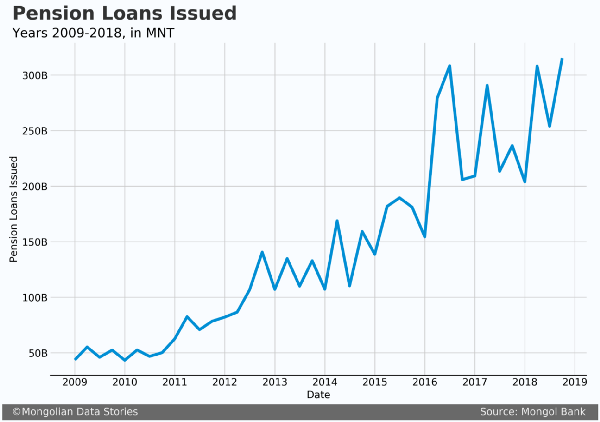
Other than the obvious large increases in both, the thing to notice is when each increases during the year. It is already noticeable that pension loans have a spike at the beginning of each year while salary loans spike later.
To do a trend analysis we can use the handy Prophet package from Facebook. There is a built-in seasonality tool that is perfect for this analysis. The tool is built on daily data analysis, so changes were made to accommodate a quarterly period (mainly reducing the Fourier order for seasonality). The graphs below show the derived trends.
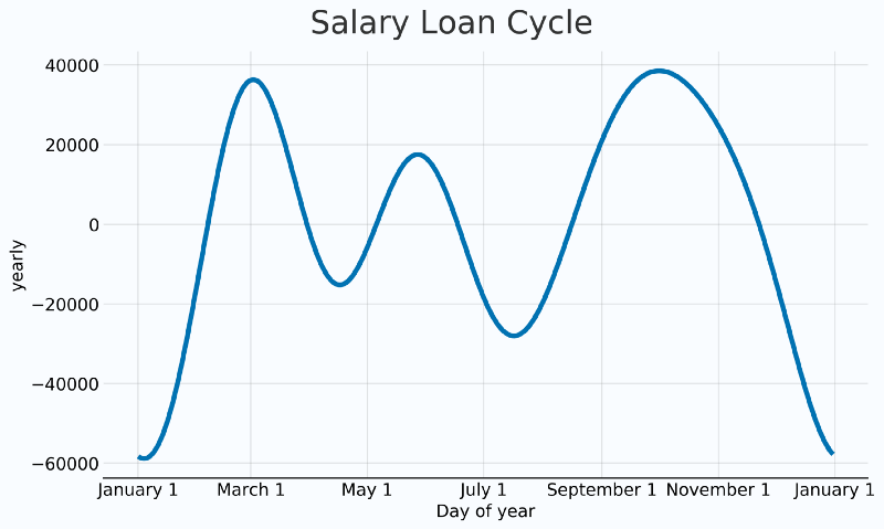
It is important to remember when interpreting these graphs that as we only have one data point per quarter, Prophet is interpolating the trends between the quarters. For reference, quarters end March 31, June 30, September 30, and December 31.
Salary loans do show a large trend in Q1, but the largest trend appears to be in Q3. Perhaps parents trying to get enough money to pay for school tuition, clothes, etc.?
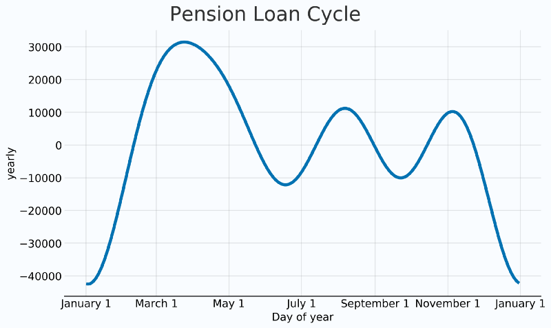
Pension loans have an obvious upward trend in Q1, with Q2 and Q3 being significantly smaller. Can we answer our question?
Do pension or salary loans issuances show an increase for Tsagaan Sar separate from the rest of the year?
Well, we certainly see a large increase in pension loans in Q1, which is when you would expect Tsagaan Sar expenditures, and therefore the need for cash. This certainly seems to fit with the narrative that the elderly are the most impacted, and are taking out loans specifically for the holiday.
Perhaps if you visit a family next year for Tsagaan Sar you may consider giving a bit more money to help offset these costs.
Mongolia's Economic Future is Chained to China
That is, unless Mongolia’s export partners diversify
It’s a rather gloomy title, but it is appropriate. There has been much discussion about diversifying the Mongolian economy to avoid the boom and bust cycle that has become common. Less has been discussed regarding diversifying trading partners.
For those familiar with the Mongolian economy, it is clear that China plays a big role in imports to the country. Yet I believe it is less known by the average Mongolian how closely exports are tied to China as well.
With all of the efforts of diversification, is the economy safer if nearly all of Mongolia’s exports go to one trading partner? Now factor in Chinese government whims to close the border whenever it fancys. This seems to be a recipe for economic uncertainty.
To understand just how closely Mongolia’s exports are tied to China I gathered data from the National Statistical Office and dug in. These data show Mongolia’s export value from 2005–2017 and is broken down by country.
Mapping Exports
First I wanted to visually see where Mongolia’s products and services are going around the world. I animated a global map, showing a new image for each year, and shaded the countries by the amount of exports going to that country. The darker the higher the value.

China remains dark throughout the period while other trading partners get significantly lighter. There is only one country that ends darker than it started, the United Kingdom. Interestingly enough back in 2005 the United States was number two, yet was still far away from the export value of China.
Charting Exports
Let’s take a look at real numbers now. But I warn you, they aren’t any prettier.
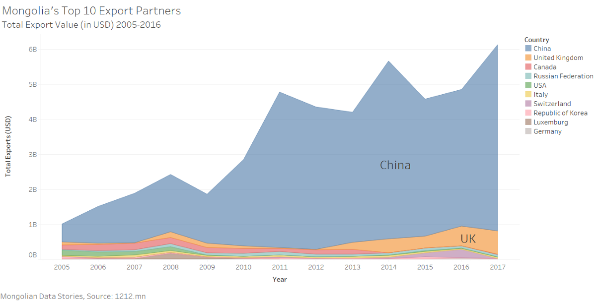
Here you can see the massive proportion of exports going to China from Mongolia. Every other country is dwarfed.
Total Exports
Of course it’s not all doom and gloom. Since 2005 Mongolia’s exports have increased tremendously, propelling the country’s economy to new heights. The total value has gone from just over 1 billion USD to over 6 billion USD today.
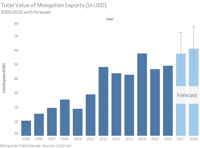
Total value of Mongolian exports with a linear forecast. Error bars shown are based on a 95% confidence interval.
Mongolian exports will continue to grow, and hopefully in a diversified way that includes more than natural resources and more than just China. Putting all your eggs in one basket is never a good idea.
Mongolians are more in debt now than ever

But they are also richer.
The economy is picking up steam in Mongolia. This is good news for the country’s businesses, who can hope the economic growth will translate to more money in peoples pockets. However, in a country that has experienced dramatic up and down swings of the economy, hope may not be in large supply.
As I always tell my students, if you have a question, dig into it and test your hypothesis. My hypothesis is that debt levels may be reaching a critical amount that the economy can no longer bear. This will result in a lack of free cash for regular citizens and a weakening of non-mining economic growth. But hey, don’t take my word for it. Let’s look at the data.
A huge amount of construction has taken place in recent years along with an increase in average salaries. Financing all of this building are commercial loans and also a government backed mortgage program offering the lowest rates in the country. This has led to an explosion of outstanding loans to finance the building of apartments and businesses.
Below I’ve charted outstanding loans and deposits from 2001–2016 (the most recent year available from the national statistical office). After the mining boom in the early 2010’s loans skyrocketed.
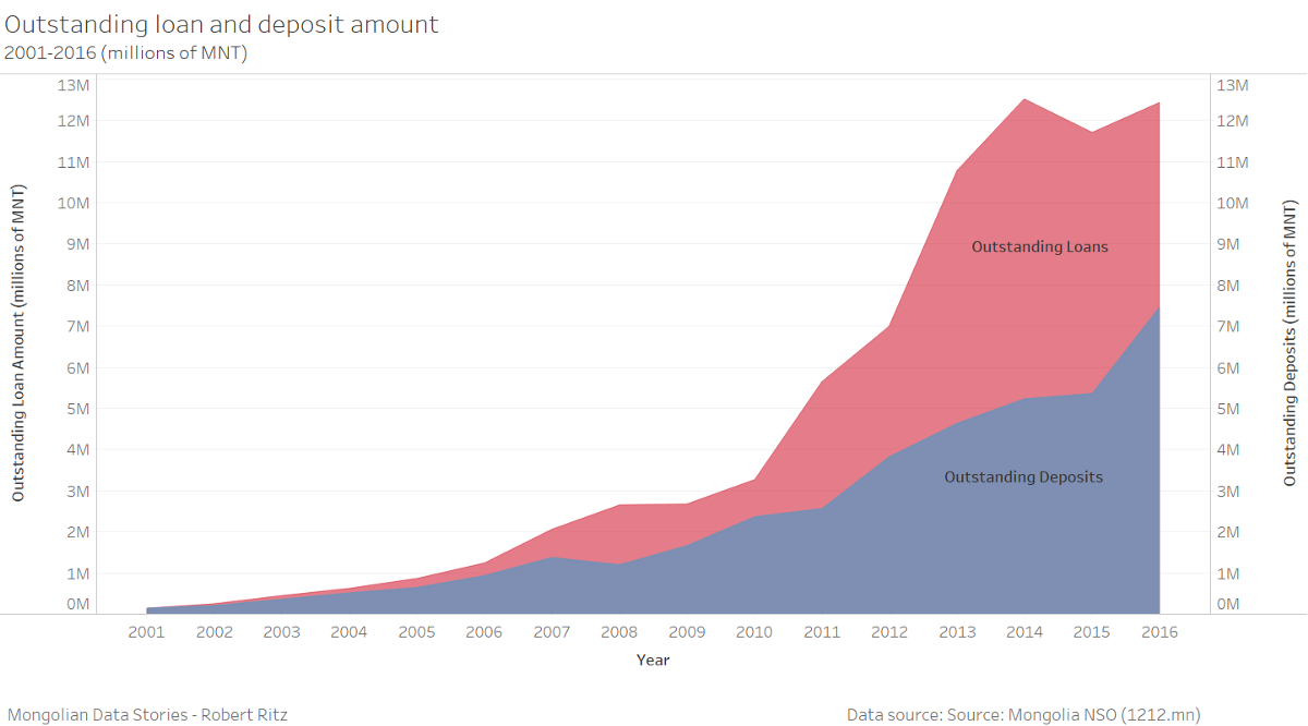
The amount of outstanding loans is nearly 12.5 trillion MNT (just over 5 billion USD). At the same time deposits have grown significantly, but not at the same pace as loans. Ulaanbaatar leads the country in outstanding loans with 78% of all outstanding loans. These numbers combined with estimates in 2017 that there are 35–40 thousand empty apartments in Ulaanbaatar are quite concerning.
Is this debt trend national? Below I mapped the total of outstanding loans per capita in 2016 for each province (aimag) using Tableau. I excluded Ulaanbaatar as it highly imbalanced the map. As this is per capita we are balancing each provinces population to better compare them. For comparison Ulaanbaatar had a total outstanding loans per capita of 26.88 million MNT (nearly 11,000 USD).
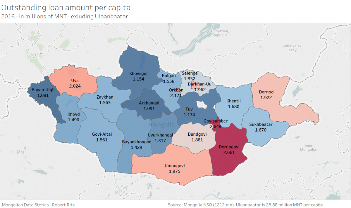
It seems pretty clear debt is consolidated primarily in Ulaanbaatar. This is both good and bad. Nearly half the population and most of the economic activity of the country is in Ulaanbaatar. However this also probably means the average UB’ier has more debt than the average person in the countryside. With youth unemployment over 20%, debt in the nations capital may prove too much to bear.
A first look at Mongolian crime data
Note from April 2021: The crimemap referenced in this no longer works. It seems the government of Mongolia is no longer supporting this project.
A few months ago I stumbled across a very interesting site made by the Mongolian national police that allows you to map crimes all around Mongolia. At the same time I was introduced to Google Data Studio, a relatively new product from Google that allows you to create dashboards from live data. I thought it was a natural fit to mash the two together and make an attempt at a “Mongolian Crime Dashboard”. The rest of the article I will explain about this dataset, its features, and how I mashed it up with Data Studio.
 What the Mongolian Crime Map looks like. Looks amazing but the locations are suspect. Source: crimemap.police.gov.mn
How the Mongolian Crime Map Is Different
At first glance the Mongolian crime map was similar to crime maps of Chicago. You can visualize categories of crime over a specified time and it shows the locations of each crime. But the Mongolian data are less complete and messier than what would be ideal. The fields include the crime type, report number, date of report, location data down to the khoroo (neighborhood), and police station. However a few differences are clear when I dug in deeper.
First of all the location data used to map the crimes on the map do not appear to be entirely reliable. Crimes appear to be mapped outside of their areas in some cases. Some crimes appear in entirely different countries. For example I found two crimes in Europe, a few in Siberia, and a few in China. So I determined using the mapped coordinates was a less than perfect way to use this data.
Second is the report location. It is a text field with the city/province, soum (like a county), district, and khoroo (sub-district / neighborhood). All of these details are separated by commas or spaces, with quite a bit of variability. I was able to use some regex functions in good old Excel to clean it up. Not ideal but workable.
Last is the time period available. Only 2015 and 2016 appeared to be complete. 2014 and 2017 seem to be incomplete as the total number of crimes is quite a bit lower. As such I focused on 2015–2016 for the dashboard. My theory as to the incomplete data for 2017 is either that they haven’t entered the reports or they only enter cases that are closed after a certain period of time. Either way it should be understood that there may be some missing data in the years 2015–2016 as well.
Mongolia’s National Statistical Office
Mongolia’s National Statistical Office (NSO) does a great job of collecting crime totals as well. However their data are only reported down to the soum/county (outside Ulaanbaatar) or district level (inside Ulaanbaatar). This makes comparing neighborhoods difficult as some districts are quite large. Nearly 50 kilometers long in some cases.
 Map of Ulaanbaatar districts. This is the smallest unit the NSO records crime data for. Credit: The Mongolist
A major advantage is the NSO has complete data from 2010–2015, much longer than what is available from the Mongolian Crime Map. This historical data could be very valuable in things like crime forecasting, which could be very helpful in policing. However this historical data is compiled yearly so we would be unable to see trends outside of year to year.
The Dashboard
Google has come a long way since launching Data Studio last year, and the product is still in beta (per usual with Google). It is already a very powerful tool and clear competitor to Microsoft’s Power BI. Even things like geo maps are relatively simple to make and are well documented. These are normally challenging to make as most software is geared to the developed world.
 Mongolian crime dashboard. Google Data Studio is limited to mapping down to the province level.
Time series look great and are easily filterable, although are a bit messy.
 Comparing Ulaanbaatar crime to provincial crime for Q4 2016.
It is important to note that much of the labels are in Mongolian, but Google Translate does a pretty good job on most of the labels if needed.
Have suggestions or comments? Feel free to drop a comment below.